Create a MiniApp Project with ReactJS & TailwindCSS
MiniApps are the most fundamental components of SuperApp ecosystems and they are web applications that work in a mobile-responsive manner within SuperApp applications. Miniapps provide a quick and easy way for users to meet their needs, and as a result, they are becoming increasingly popular. While there are no technological limitations to developing a MiniApp, single-page application frameworks are commonly preferred for developing MiniApps nowadays. ReactJS, VueJS, AngularJS and Svelte are among the most popular options for MiniApp development.
It is extremely important for a project developed as a MiniApp to be responsive. MiniApps can be opened in different sizes on different mobile devices, so it is necessary for the application to be compatible with every device. Therefore, considering responsive design in the MiniApp development process is important.
TailwindCSS is a popular utility-first CSS framework that can help you build responsive and customizable user interfaces quickly. This article presents an example MiniApp project with ReactJS and TailwindCSS, which are widely used technologies within the Kobil SuperApp.
Step 1: Creating a New ReactJS Project
To create a new ReactJS project, you need to install node at first. After than open your terminal and navigate to the directory where you want to create the project. Then, run the following command:
npx create-react-app my-project
Once you have created your ReactJS project, you need to install TailwindCSS to use. You can find the setting up documentation by click here.
Step 2: Creating Main Page
You can add the following code to the app.js file.
function App() {
  const mockImg = [
    'https://www.kiwiqa.com/wp-content/uploads/2017/11/mobile-testing_service.jpg',
    'https://oaksys.net/wp-content/uploads/2018/08/Oaksys-Mobile-Application-Testing.jpg',
    'https://www.perfecto.io/sites/default/files/image/2020-08/image-blog-perfecto-mobile-app-checklist.jpg',
    'http://ec30.org/wp-content/uploads/2017/01/Illus-Mobile_0.png',
  ];
  const [isOpen, setIsOpen] = useState(false);
  return (
    <>
      <div className="navbar sticky top-0 bg-blue-600">
        <div className="flex w-full flex-wrap items-center justify-between p-6 pt-4">
          <div className="mr-6 flex flex-shrink-0 items-center text-white">
            <div className="block lg:hidden">
              <button
                onClick={() => setIsOpen(!isOpen)}
                className="mr-4 flex items-center rounded border border-gray-400 px-3 py-2 text-gray-200 hover:border-white hover:text-white"
              >
                <svg
                  className="h-3 w-3 fill-current"
                  viewBox="0 0 20 20"
                  xmlns="http://www.w3.org/2000/svg"
                >
                  <path d="M0 3h20v2H0V3zm0 6h20v2H0V9zm0 6h20v2H0v-2z" />
                </svg>
              </button>
            </div>
            <span className="text-xl font-semibold tracking-tight">
              MiniApp
            </span>
          </div>

          <div
            className={`w-full flex-grow lg:flex lg:w-auto lg:items-center ${
              isOpen ? 'block' : 'hidden'
            }`}
          >
            <div className="text-sm lg:flex-grow">
              <a
                href="#responsive-header"
                className="mt-4 mr-4 block text-gray-200 hover:text-white lg:mt-0 lg:inline-block"
              >
                Docs
              </a>
              <a
                href="#responsive-header"
                className="mt-4 mr-4 block text-gray-200 hover:text-white lg:mt-0 lg:inline-block"
              >
                Examples
              </a>
              <a
                href="#responsive-header"
                className="mt-4 block text-gray-200 hover:text-white lg:mt-0 lg:inline-block"
              >
                Blog
              </a>
            </div>
            <div>
              <a
                href="#"
                className="mt-4 inline-block rounded border border-white px-4 py-2 text-sm leading-none text-white hover:border-transparent hover:bg-white hover:text-gray-500 lg:mt-0"
              >
                Get Started
              </a>
            </div>
          </div>
        </div>
      </div>
      <div className="min-h-[calc(100vh-152px)] px-6 pt-4  pb-12 sm:px-12">
        <h1 className="mb-8 text-[34px] font-bold">Services</h1>
        <div class="xs:grid-cols-2 mb-6 grid grid-cols-1 gap-8 md:grid-cols-4">
          {mockImg.map((item, key) => (
            <img
              className="h-full w-full rounded-xl border border-gray-300 p-4"
              src={item}
            />
          ))}
        </div>
        <p className="py-6 text-gray-700">
          Lorem ipsum dolor sit amet, consectetur adipiscing elit, sed do
          eiusmod tempor incididunt ut labore et dolore magna aliqua. Sed enim
          ut sem viverra aliquet eget. Fermentum odio eu feugiat pretium.
          Viverra suspendisse potenti nullam ac. Aenean pharetra magna ac
          placerat vestibulum lectus mauris ultrices. Eget duis at tellus at
          urna condimentum mattis pellentesque id. In pellentesque massa
          placerat duis ultricies lacus sed turpis. Elit pellentesque habitant
          morbi tristique senectus et netus et malesuada. Nibh tellus molestie
          nunc non blandit massa. Dictum at tempor commodo ullamcorper a. Congue
          quisque egestas diam in. Eget felis eget nunc lobortis mattis. Nunc
          sed augue lacus viverra vitae. Justo donec enim diam vulputate.
          Habitasse platea dictumst quisque sagittis purus. Sit amet massa vitae
          tortor condimentum lacinia. Felis bibendum ut tristique et egestas
          quis ipsum suspendisse ultrices. Morbi blandit cursus risus at
          ultrices mi tempus imperdiet nulla.
        </p>
      </div>
      <footer className="bg-blue-600 text-center text-white">
        <div className="w-full px-12 pt-6">
          <div className="mb-6">
            <p>
              Lorem ipsum dolor sit amet consectetur adipisicing elit. Sunt
              distinctio earum repellat quaerat voluptatibus placeat nam,
              commodi optio pariatur est quia magnam eum harum corrupti dicta,
              aliquam sequi voluptate quas.
            </p>
          </div>
        </div>

        <div className="p-4 text-center">
          © 2023 Copyright:
          <a className="text-white" href="#">
            Kobil
          </a>
        </div>
      </footer>
    </>
  );
}

export default App;
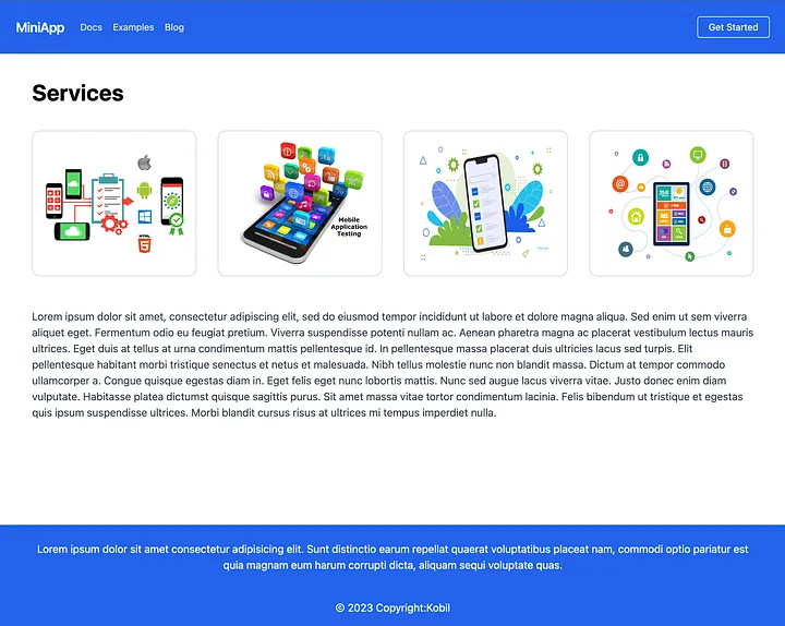
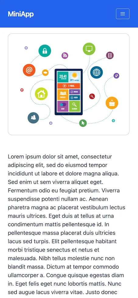
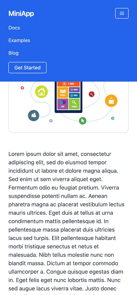
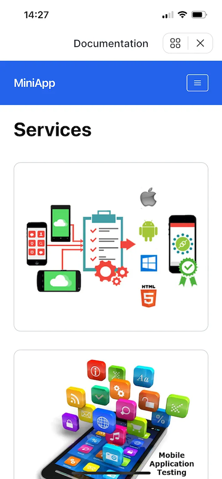
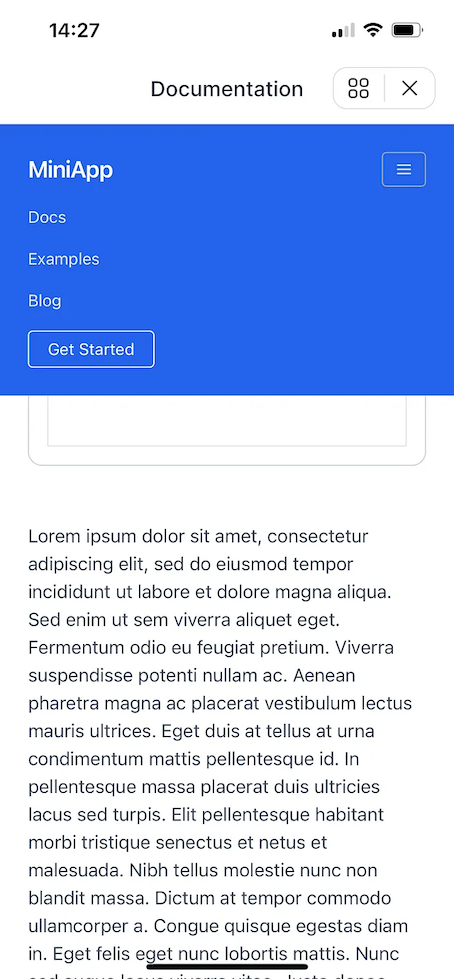
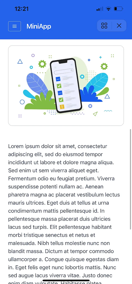
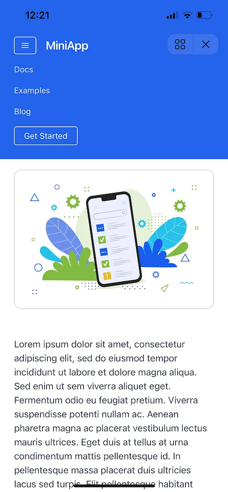
When you run the code block given above, you will see the result shown in the images given below.
Step 3: Adding Viewport Element in <meta>
The ‘viewport’ meta tag helps to make the MiniApp responsive. It provides
information about the screen width, scaling, and other features of mobile
devices, ensuring that the MiniApp is displayed correctly on different devices.
Therefore, MiniApp developers should ensure that the ‘viewport’ tag is used
correctly. You need to add the following line of code to index.html.
<meta
  name="viewport"
  content="width=device-width, initial-scale=1, maximum-scale=1, minimum-scale=1, user-scalable=no, viewport-fit=cover"
/>
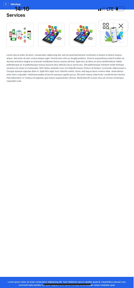
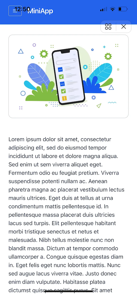
If the viewport element is not used, the website will appear distorted on mobile devices and different screen sizes. You can see the appearance that emerges when the viewport element is not used in the following screenshot.
Step 4: Removing KOBIL SuperApp Header
Kobil SuperApp allows for the removal of the header of the created mini-apps,
which makes it possible to use the MiniApp in full screen mode. To achieve this,
all you need to do is create a configuration file named miniApp.json and place
it in the root directory of your website’s defined address. Furthermore, you can
customize the miniApp.json file according to your preferences. This way, you
can change the background color or make the superapps button transparent, among
other things.
{
  "version": "2.0",
  "fullScreen": false, //'true' enalbes fullScreen, and statusBar is invisible
  "theme": "app-default",
  "statusBar": {
    "theme": {
      "light": {
        "backgroundColor": "#b5b02c"
      },
      "dark": {
        "backgroundColor": "#ae2929"
      }
    }
  },
  "navigationBar": {
    "visible": true, //'false' hides the navigationBar
    "theme": {
      "light": {
        "backgroundColor": "#5f9ea0"
      },
      "dark": {
        "backgroundColor": "#2e1a1a"
      }
    }
  }
}
After creating the miniApp.json file, the application will cover the entire
screen and the title of the website will overlap with the device’s top
navigation bar. This overlap can prevent users from reading the title and
navigation bar properly. Therefore, to eliminate this overlap, the safe area
can be used. To implement this, the following code block should be added to the
CSS file.
padding: env(safe-area-inset-top) env(safe-area-inset-right) env(safe-area-inset-bottom) env(safe-area-inset-left);
Consequently, important points to consider when creating a MiniApp and the MiniApp development process have been discussed.