User Interface Elements
The user interface (UI) elements in your service play a crucial role in shaping the overall user experience. These elements include everything from navigation bars and buttons to forms and icons. Well-designed UI elements ensure that users can interact with your service intuitively and efficiently. This section provides guidelines for designing and implementing various UI components to create a cohesive and user-friendly interface. By adhering to these guidelines, you can help users navigate your service with ease, enhancing their overall experience and satisfaction.
Navigation
Whenever a user enters your service, it is your responsibility to clearly inform them of their current location and where they can navigate from there, and how to get back. Use consistent navigation elements and provide clear feedback to ensure that users can easily browse through screens without getting lost. This approach allows you to provide a safe and enjoyable experience, enhancing user satisfaction and trust in your service.
Top Navigation
Service Menu Icon
Service Menu Icon: For all service screens, KOBIL will place a fixed icon in the upper right corner, including the service menu on the left and a close icon on the right, as illustrated below. Developers are not permitted to customize this content. The service menu icon remains in a constant position on the screen. Avoid placing other elements in this area during design. If you need to add interactive elements around this menu, ensure they do not cause conflicts and that their operation remains user-friendly.
Service Menu Icon Color Scheme
Service Menu Icon Color Scheme: There are two color schemes available: one for light backgrounds and one for dark backgrounds. If the service background is light, the dark icon will be used, and if the background is dark, the light icon will be used. Examples are illustrated below.
In-Service Navigation
In-Service Navigation: You can incorporate your own navigation based on your functional design requirements. Ensure consistency in navigation across all screens to enable easy movement backward and forward. Given the limited size of mobile screens, keep your service navigation straightforward and user-friendly. It is recommended to design your service navigation bar to be distinctly different from the KOBIL service menu icon for easy differentiation.

Bottom Navigation
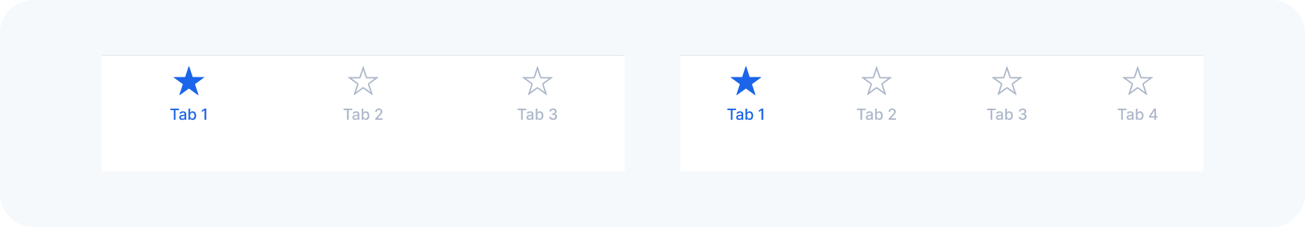
Tab Bar
Tab Bar: Tab bars are an essential navigation element, helping users quickly switch between different sections of your service. Ensure that tab labels are clear and concise, and use icons that are easily recognizable. Maintain consistency in the design and placement of tab bars across your service to provide a familiar and intuitive navigation experience.
-
Visibility: Ensure the tab bar is always visible while users navigate through different areas of the service, except within a modal view. Since modal views are designed to focus user attention on a specific task or content and are intended to be temporary interruptions, hiding the tab bar in this context doesn't impact overall navigation.
-
Number of Tabs: Use the minimum number of tabs necessary for effective navigation. Too many tabs can make the app more complex and harder to navigate. Typically, keep to up to five tabs to avoid overcrowding and truncation of labels.
-
Consistent Tab Visibility: Keep all tabs visible at all times, even if their content isn't currently available. This consistency prevents the interface from appearing unstable. If content is unavailable, provide an explanation.
-
Tab Titles: Choose clear and descriptive titles for tabs to enhance navigability. Preferably, use single words or very short phrases that precisely describe the content or function of the respective tab, like Shop, Stores, or For You.
Buttons
Buttons are a fundamental component of user interfaces, serving as primary points of interaction. They enable users to perform actions and make choices with a simple tap or click.
Design and Appearance
-
Style Consistency: Maintain a consistent style for buttons across the service. Use uniform shapes, colors, and sizes to ensure that buttons are immediately recognizable as interactive elements.
-
Visual Hierarchy: Design buttons to reflect their importance. Use bolder or more distinct styles for primary actions and subtler designs for secondary actions. This helps users intuitively understand which actions are more critical.
-
Accessibility: Ensure that buttons have sufficient size and padding to be easily tapped on touch devices. Colors should have adequate contrast to be distinguishable by all users, including those with visual impairments.
Interaction and Feedback
-
Clear Labeling: Use concise and descriptive labels that clearly communicate what will happen when the user presses the button. Avoid vague terms, opting for action-oriented words like "Save," "Submit," or "Download."
-
Immediate Feedback: Provide instant visual or tactile feedback when buttons are interacted with. This could be in the form of color change, animation, or a haptic response, helping users understand that their action has been recognized.
Placement and Usage
-
Strategic Placement: Position buttons where they are easily accessible to the user, typically at the bottom of the screen or form. Avoid placing buttons in locations where they might lead to accidental presses.
-
Grouping and Spacing: When multiple buttons are present, space them adequately to prevent user errors while ensuring they are grouped logically. For example, grouping "Save" and "Cancel" closely aligns with user expectations and facilitates efficient interaction.
Types of Buttons
-
Primary: Designate the most important action in a user interface with a primary button. This should stand out more than any other button and be used for the main action you want users to take.
-
Secondary: Use these for actions that are less critical. These buttons should be less prominent than primary buttons and used for secondary actions like "Cancel."
-
Disabled: Use disabled buttons to indicate actions that are not currently available. These should appear visually distinct, typically in a muted color to signify inactivity.

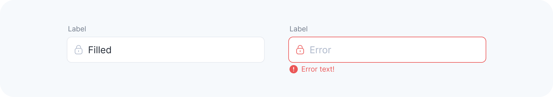
Text Fields
Text fields are essential UI elements used for gathering textual data from users. They allow for the input of names, numbers, emails, and other necessary information.
Design and Appearance
-
Clarity and Distinction: Ensure text fields are visually distinct from other elements on the page. They should have a clear boundary, such as a border, to indicate where users can enter text.
-
Labeling: Each text field should have a descriptive label that is positioned in a way that remains visible, even after the user begins typing.
Interaction and Feedback
-
Placeholder Text: Use placeholder text to provide hints or examples of the expected input, like "Enter your email address." This text should be clear but subtle so that it doesn’t overpower the actual user input.
-
Focus and Navigation: When a user selects a text field, it should clearly show focus, typically with a visual cue such as a border highlight.
-
Validation: Provide real-time validation and feedback, such as indicating errors immediately after the input is made.