Branding
Customizing Your App's Appearance -** Branding plays a crucial role in creating a visual identity that aligns with your SuperApp's goals and enhances user experience. This section explains how to tailor your app’s branding elements, such as logos and color schemes, to match your desired style and strengthen your app’s identity.

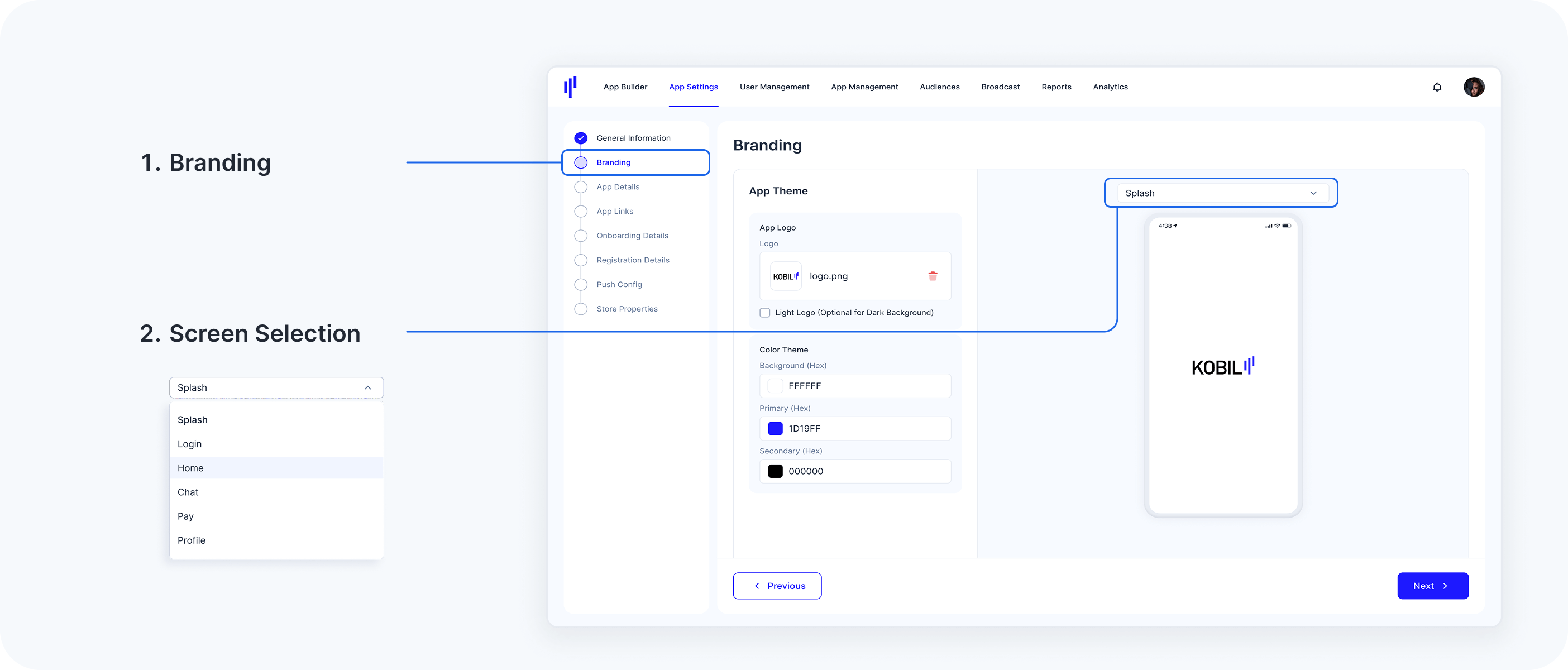
Step 1: Access the Branding Section
To begin customizing your app's branding:
-
Navigate to the Branding section, which is located right after General Information in your dashboard.
-
Select the app screen you wish to preview and customize (e.g., Splash Screen, Login, Home, Chat, Pay, Profile). This allows you to immediately visualize the changes as you make them.
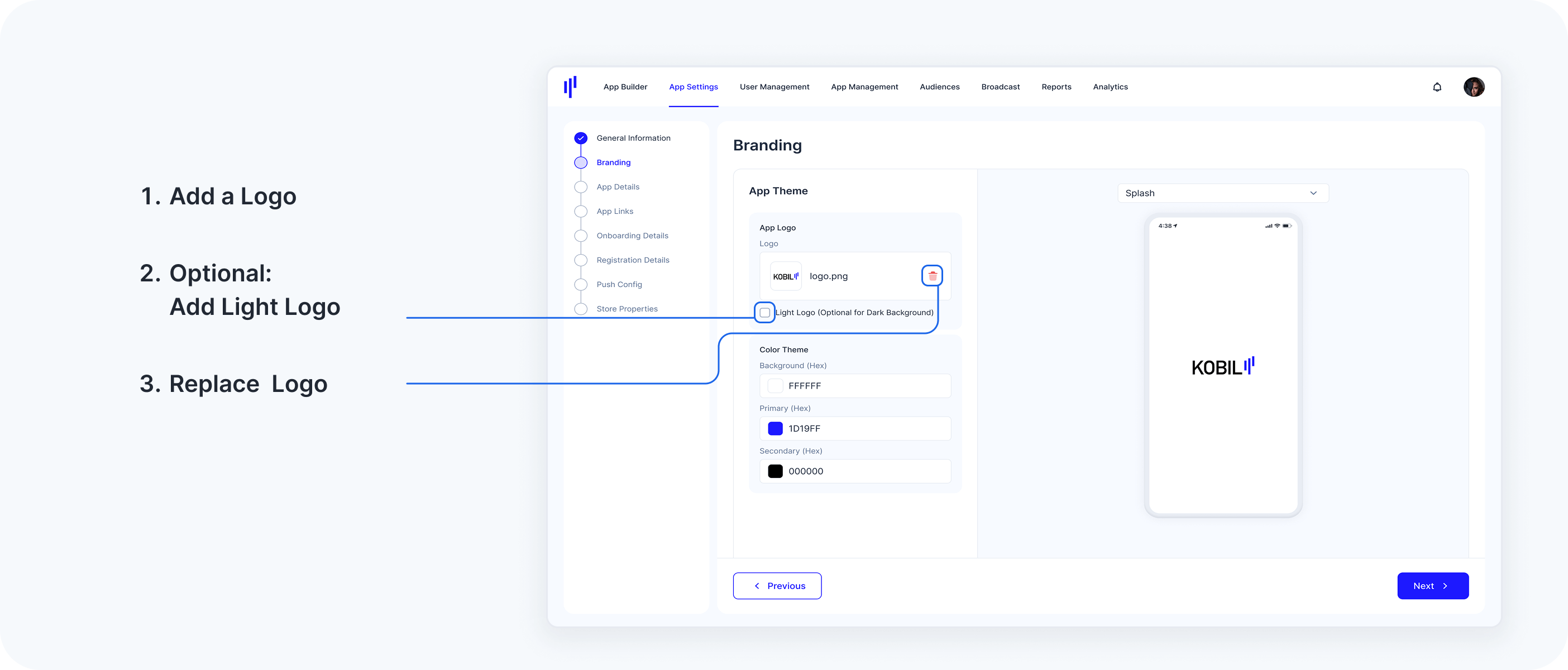
Step 2: Upload Your App Logo
The App Logo serves as a key element of your branding. Here's how you can upload and customize it:
1. Add a Logo:
Click the upload icon in the App Logo section to add your primary logo file.
Only PNG format is supported.
The logo must be 1024x1024 pixels.
Ensure your logo has a transparent background for a clean and professional look.
2. Optional: Add a Light Logo
If you want a logo specifically designed for dark backgrounds, check the box labeled Light Logo (Optional for Dark Background).
When a light logo is uploaded, the (dark) logo is disabled on all screens except the splash screen and replaced with the light logo.
3. Replacing Logo
If you need to replace an existing logo, click the trash icon next to the current logo and upload a new one.
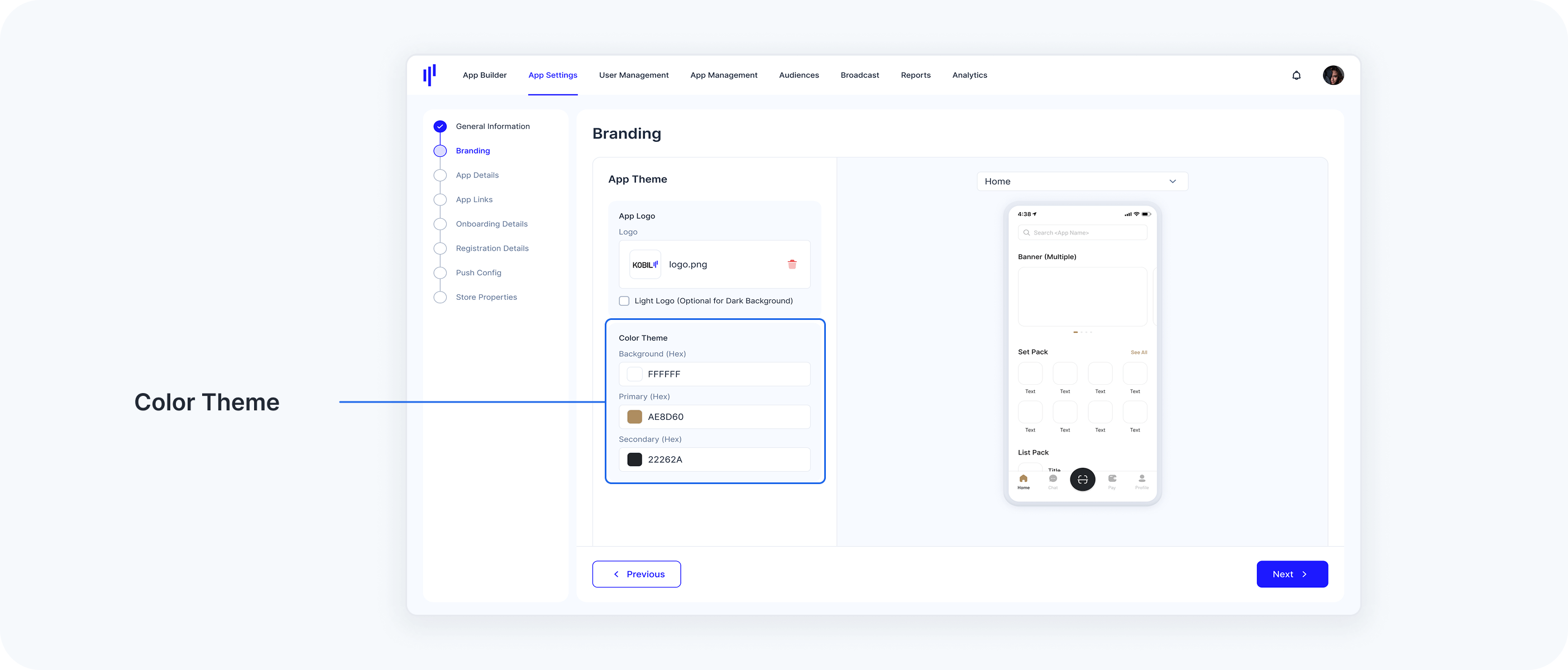
Step 3: Set Your Color Theme
Your app’s color scheme sets the tone for its user interface and overall aesthetic. Follow these steps to customize the colors. If no colors are selected, the app will appear in its default color scheme.
1. Customize Background Color
Enter the hex color code for your app's background color (e.g., #FFFFFF for white).
2. Set the Primary Color
Enter the hex code for your primary color—the main color used for buttons, highlights, and other prominent elements (e.g., #AE8D60).
3. Define the Secondary Color
Choose a secondary color for complementary design elements, such as secondary buttons, icons, or links (e.g., #22262A).
As you update the colors, a live preview will display changes in real-time. This allows you to immediately see how the branding looks on different screens, such as Login, Home, Chat, Pay, and Profile.
Step 4: Save Your Branding Changes
Once you're satisfied with your logo and color choices, follow these steps to finalize:
Review your logo and color selections to ensure they align with your branding vision.
Click Save/Next to apply your changes. The updated branding will be reflected across your app once you release a build.
Important Notes
Contrast and Accessibility: To ensure readability and accessibility for all users, make sure your color choices offer sufficient contrast.
Testing on Different Themes: Test your branding on both light and dark themes to guarantee consistency and optimal appearance in varying display conditions.