Layers
The Layers panel gives you a clear hierarchical view of your screen’s content, including sections, tabs, components, and individual services. It helps you quickly locate, rearrange, and manage elements within each section.
Structure
The content structure is always organized in the following order:
Section
└── Tabs (if added)
    └── Component
        └── Service
        └── Service
        └── …
This hierarchy is visually reflected in the Layers panel to support intuitive drag-and-drop reordering.
Component States
Filled vs. Empty Components
Each component in the Layers panel can appear in two states:
Filled: The component contains services.
Empty: No services are added yet.
Components also appear as:
In Library: Saved for reuse and stored in the Library.
Not in Library: Created directly on the screen and not stored in the Library.

Empty State
When no components have been added to the screen, the Layers panel shows only the section (e.g., Section 1) with a prompt to add your first component.
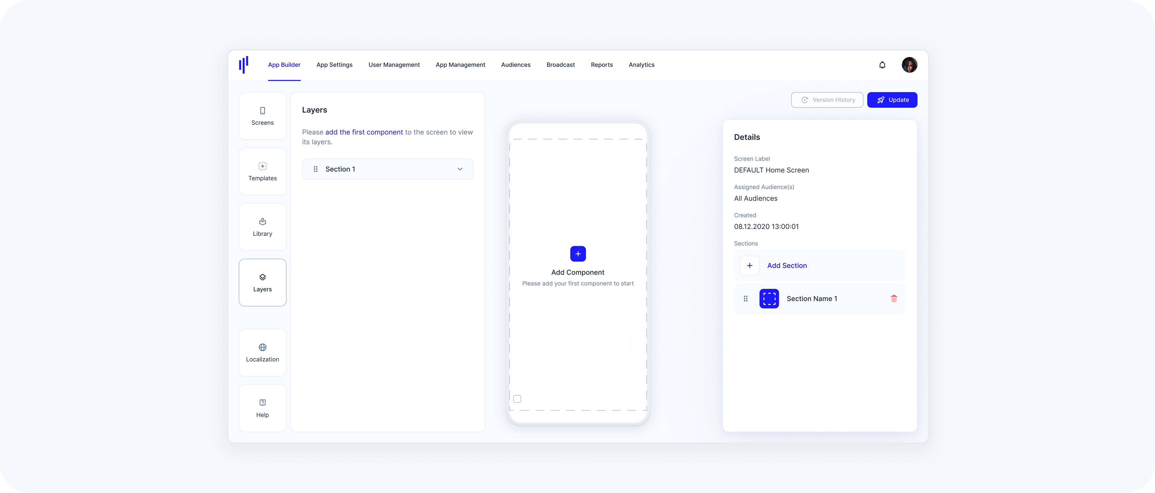
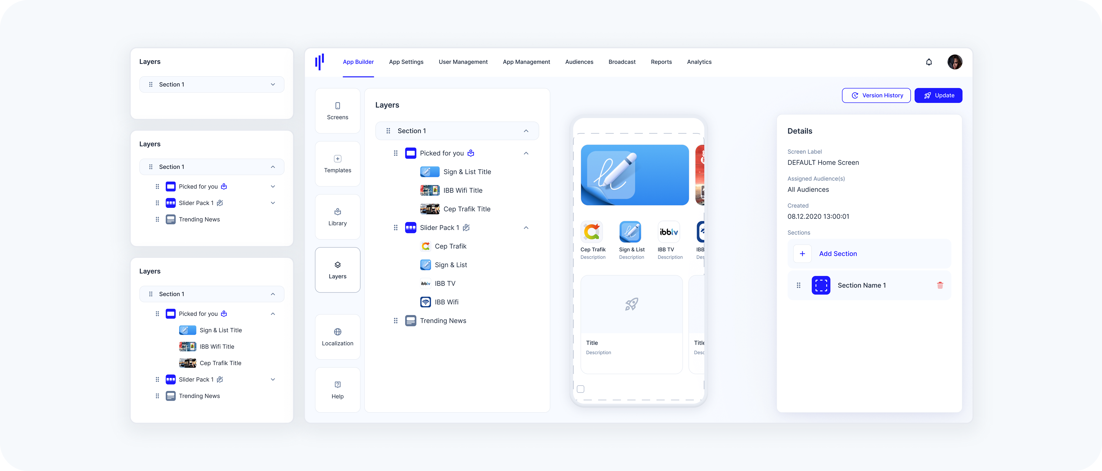
Single Section
Once a component is added directly to the default section, it appears under the section title in the Layers panel. You’ll see each component listed (e.g., “Picked for you”, “Slider Pack 1”, “Trending News”) and, depending on the component type, the nested services or titles underneath.
Single Section With Tabs
If a section includes Component-Based Tabs, the Layers panel groups components under each tab. Each tab appears as a collapsible item under the section (e.g., Productivity, Movies, Music), and each tab shows its own set of components and services.
Multiple Sections
When a screen includes more than one section (e.g., Section 1, Section 2, Section 3), each is shown in the Layers panel as a collapsible group. Each section maintains its own hierarchy of tabs, components, and services.
Working with Layers
Expand / Collapse Sections, Tabs, and Components
Click the arrow icon on the right side of a Section, Tab, or Component to expand or collapse its contents.
Collapsing helps reduce visual clutter, especially with complex layouts.
- When expanded, you’ll see nested tabs, components, and services.
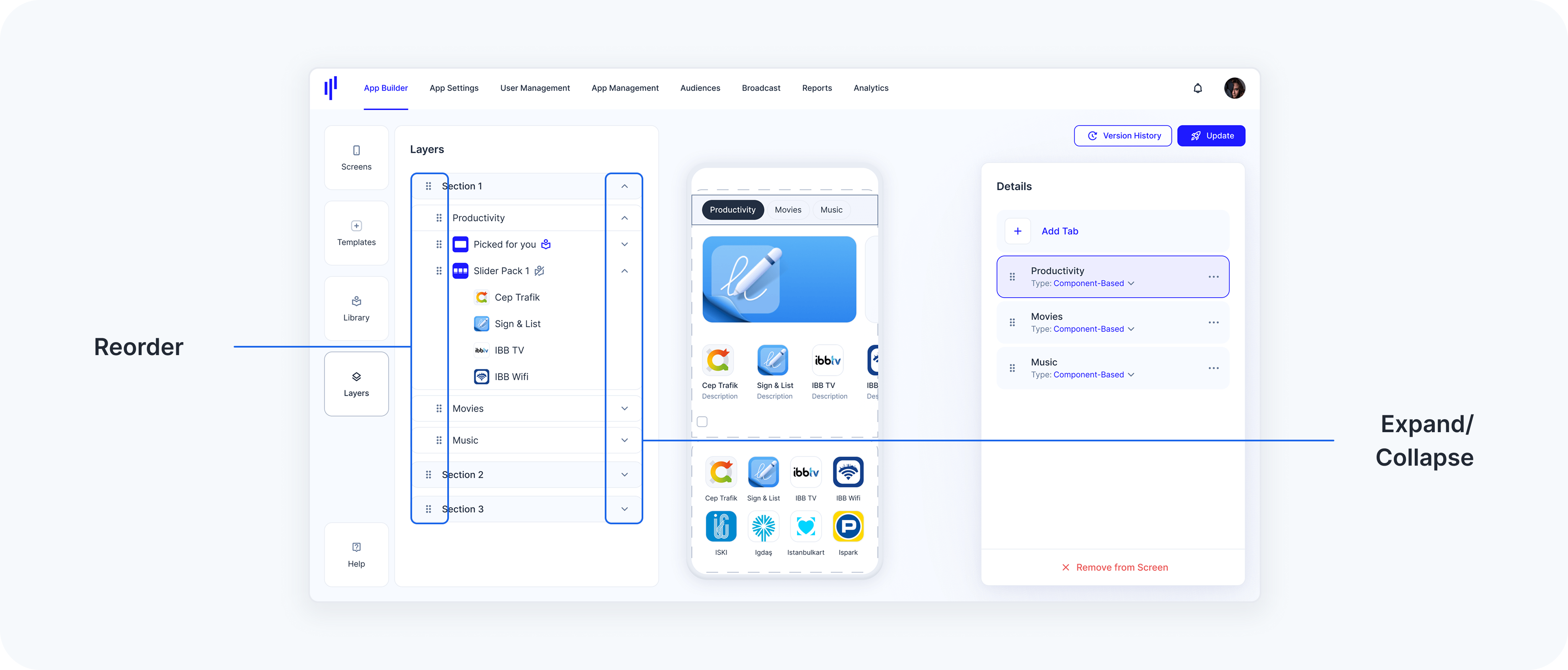
Reorder Items
Use the drag handle (≡ icon) on the left to reorder:
Sections in the screen
Tabs within a section
Components within a section or tab
Services within a component