Use Cases
This section illustrates how different combinations of layout elements — like tabs, titles, and components — can be used to build meaningful, reusable screen patterns in the App Builder.
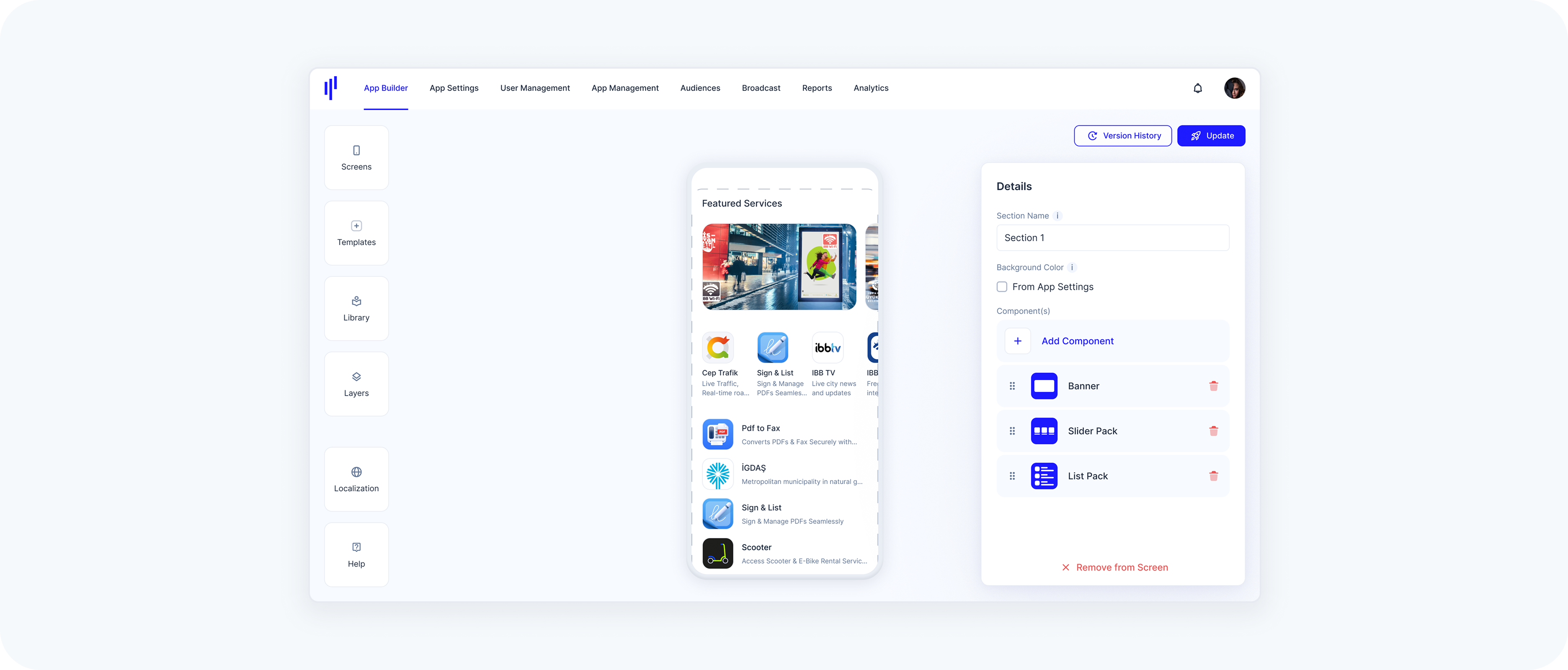
Sections Without Tabs
Sometimes, a clean vertical layout is all you need.
Example:
- A single section with:
- A Title (“Featured Services”)
- A Banner
- A Slider Pack
- A List Pack
Use Case: Great for welcome screens, promotions, or static layouts without interaction-based switching.
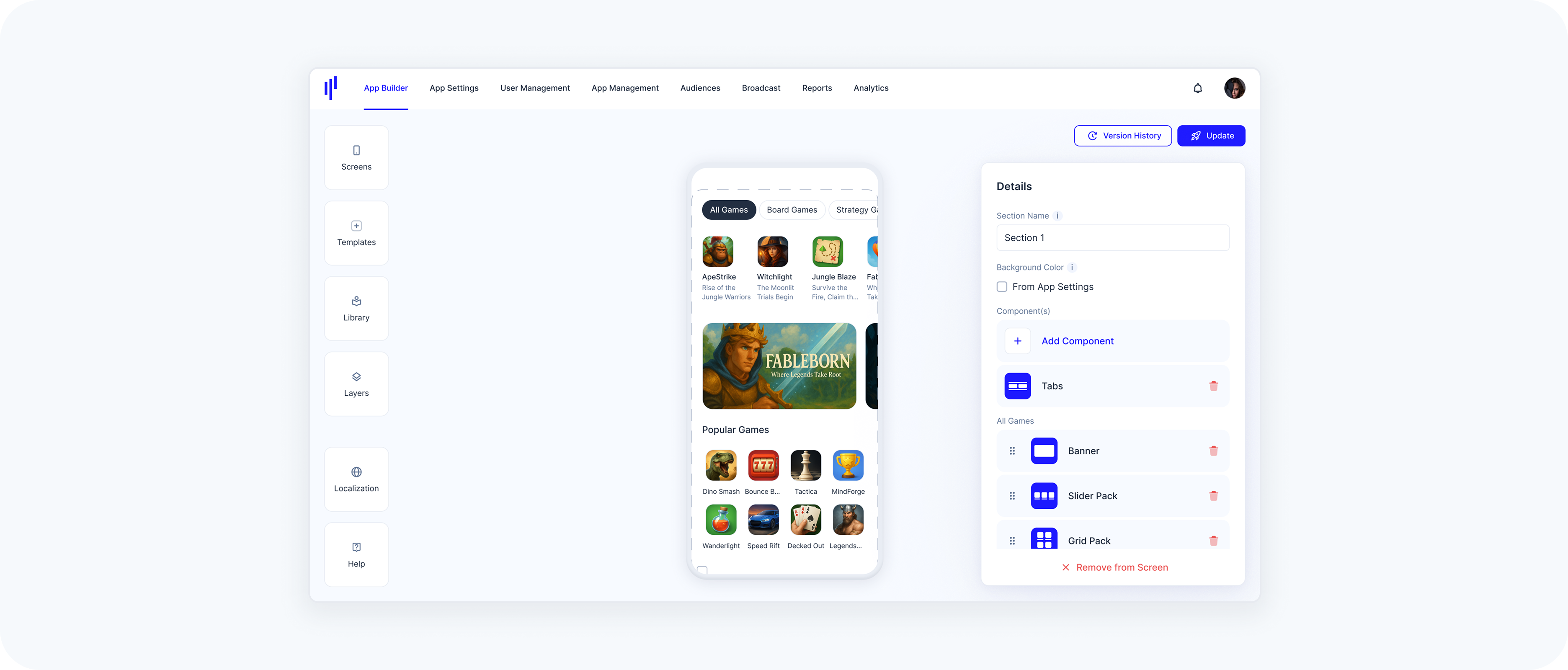
Multi-Tab Layout – Component-Based
This layout lets users switch between categories of content (each backed by different components).
Example:
- A section with:
- A Tabs area:
- Tab 1: “All Games”
- Tab 2: “Board Games”
- Tab 3: “Strategy Games”
Use Case: Ideal for structured, filterable content — like News, Games, Courses, Music, or Services grouped by popularity or recency.
Multi-Tab Layout – Web-Based
Embed multiple web pages in a single section.
Example:
- A section with:
- A Tabs area:
- Tab 1: Embedded analytics dashboard
- Tab 2: External company news page
Use Case: Useful for showing real-time dashboards, reports, or embedded web apps.
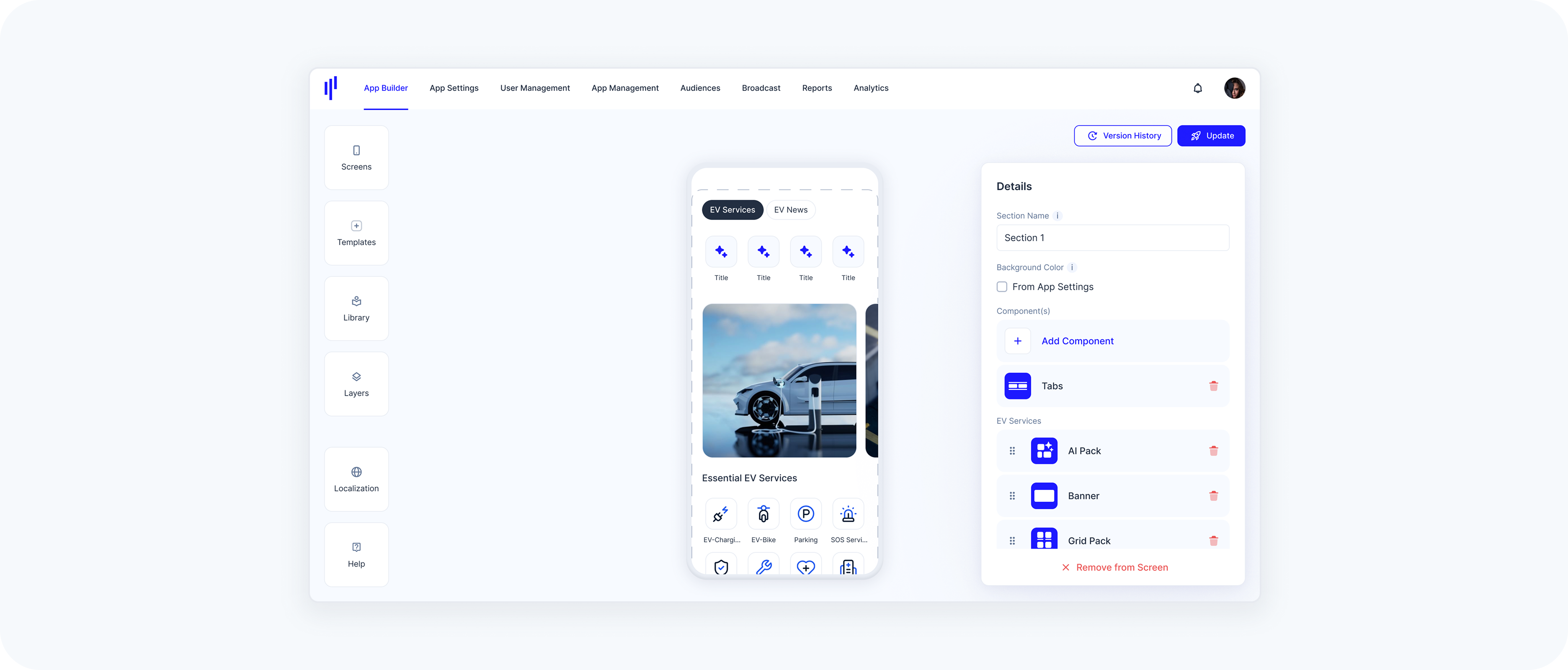
Mixed Tab Layout – Component + Web-Based
Combine internal SuperApp content and external sources within the same section using tabs.
Example:
- A section with:
- A Tabs area:
Tab 1 (Component-Based): EV Services – EV-related offerings (e.g., charging, parking, maintenance, leasing)
Tab 2 (Web-Based): EV News – Embedding real-time content from an external EV news site
Use Case: Perfect for hybrid experiences where one tab delivers curated in-app services while another pulls in dynamic external content — like industry news, documentation, or support pages.