Content (Component) Blocks
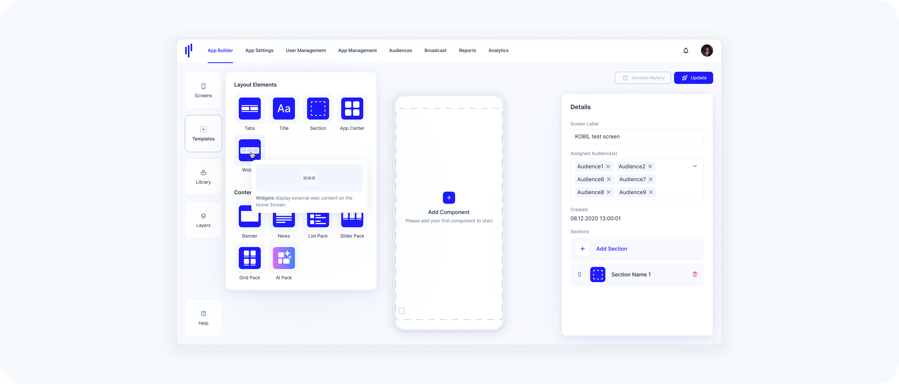
Templates allow you to build your layout using empty content blocks. These blocks act as visual placeholders and can be configured later. This is useful when you want to design the layout first and fill in the details afterwards.
Unlike the Library panel, where you use prefilled components, the Templates panel provides a blank version of each block.
While the Library panel is for reusing preconfigured components, the Templates panel provides empty content blocks. These blocks act as visual placeholders and are ideal when you want to start from scratch.
Banner
You can easily set up a Banner component using the Templates panel on the left side of the screen.
Step 1 – Open the Templates Panel
From the left-hand toolbar, select Templates to open the panel.
Drag the Banner component into the desired section on your screen.
Step 2 – Configure the Banner
In the Details panel on the right:
Enter a name for your component in the Component Name field.
Set the Aspect Ratio – Choose from 16:9, 1:1, 4:3, 2:1, or Custom depending on your visual layout needs.
Select Service Details Option – Choose how (or if) you want to show service info:
- No Service Details
- Display Service Details Inside
- Display Service Details Outside
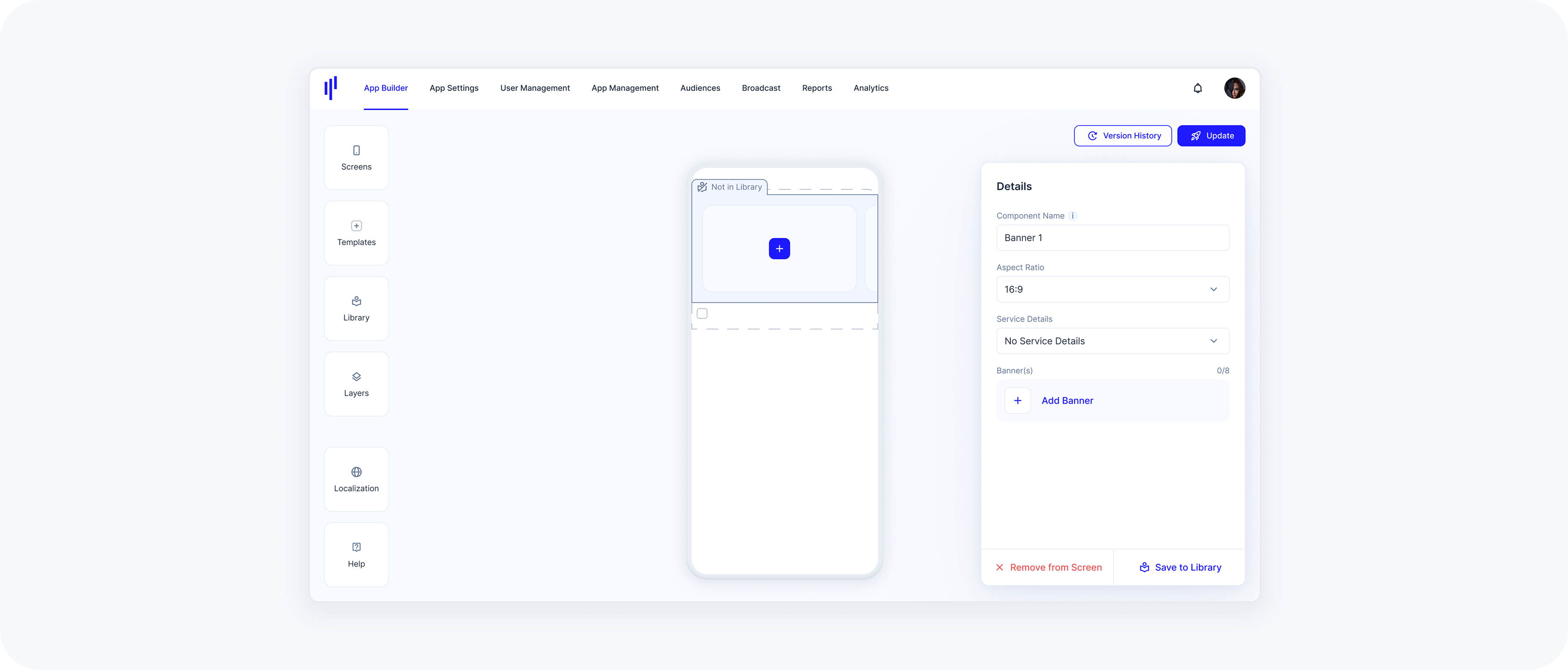
Step 3 – Add a Banner
Click Add Banner to open the configuration dialog.
Choose Service or URL as your banner type.
- Select a service from the dropdown or insert an external link.
- Upload a JPG or PNG (max 1 MB) in the selected aspect ratio.
Enable the Searchable checkbox if you’d like the banner to appear in search results.
Step 4 – Finalize
Click the Add Banner button to confirm and close the modal.
The banner will now appear in your preview and in the component details.
Each Banner component supports up to 8 banners. If you reach the limit, a message will let you know.
Aspect Ratio Change Warning
When changing the aspect ratio of a Banner after an image has already been uploaded, a confirmation modal appears with two options:
- Resize Media
The uploaded image will be resized automatically to match the new aspect ratio you’ve selected.
- Keep Original
The aspect ratio will not be changed. The image will be kept exactly as it is, preserving its original dimensions and proportions. This option simply cancels the aspect ratio change for that banner.
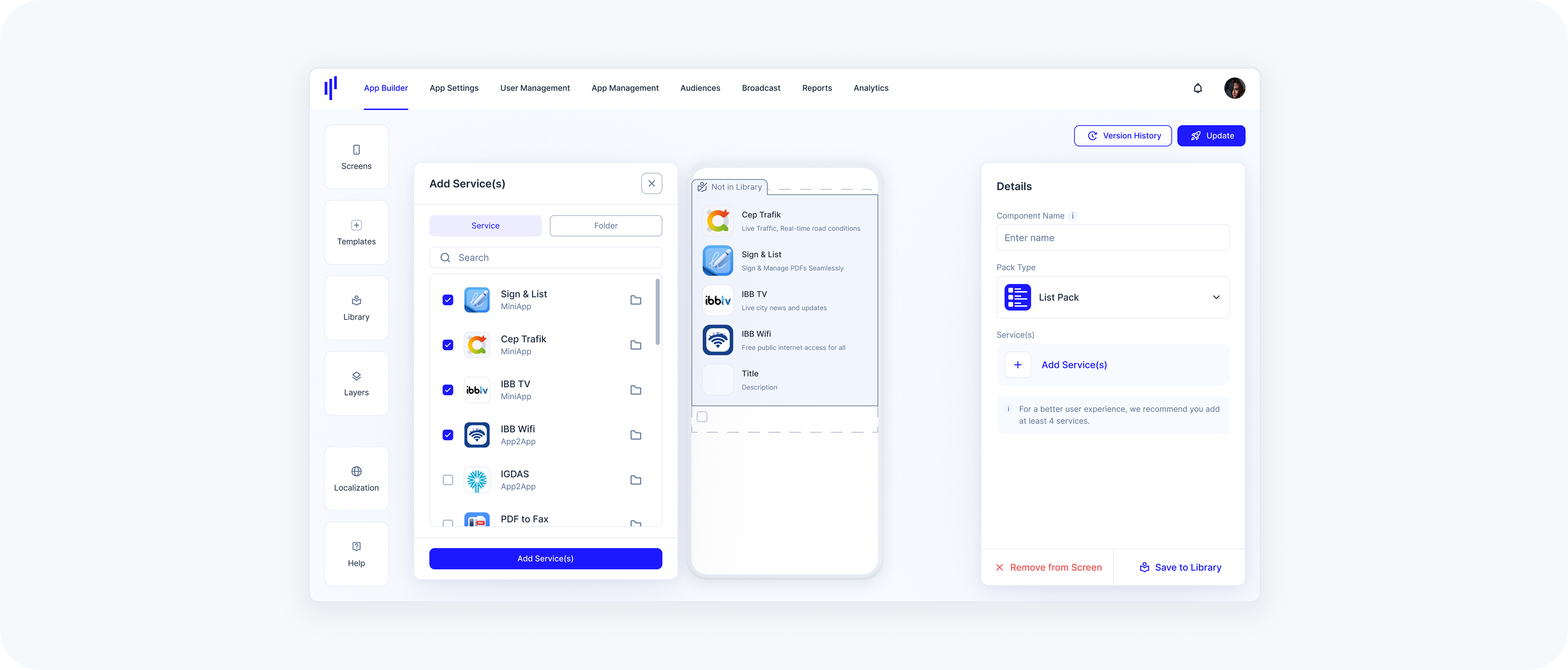
Grid Pack
A Grid Pack displays multiple services or folders in a compact, tile-based layout. It’s ideal for visually showcasing 4–8 services in a clean and balanced grid structure.
Step 1 – Open the Templates Panel
From the left-hand toolbar, select Templates to open the panel.
Drag the Grid Pack into the desired section on your screen.
Step 2 – Configure the Grid Pack
In the Details panel on the right:
Enter a name for your component in the Component Name field.
In the Pack Type dropdown, make sure Grid Pack is selected.
Step 3 – Add Services
Click Add Service(s) to open the service selection modal.
Use the checkboxes to select one or more services you’d like to display in the grid.
You can use the search bar or scroll to locate services.
- Services will appear live in the preview as you select them.
To improve layout and experience, it’s recommended to add at least 4 services.

Step 4 – Finalize
- Review your selected services in the list.
Click the Add Service(s) button at the bottom right.
Step 5 – Save to Library (Optional)
If you'd like to reuse this configuration later, hit Save to Library.
List Pack
The steps to set up a List Pack are the same as for Grid Packs:
Step 1 – Open the Templates Panel
From the left-hand toolbar, select Templates to open the panel.
Drag the List Pack into the desired section on your screen.
Step 2 – Configure the List Pack
In the Details panel on the right:
Enter a name for your component in the Component Name field.
In the Pack Type dropdown, make sure List Pack is selected.
Step 3 – Add Services
Click Add Service(s) to open the service selection modal.
Use the checkboxes to select one or more services you'd like to display in the grid.
You can use the search bar or scroll to locate services.
- Services will appear live in the preview as you select them.
Step 4 – Finalize
- Review your selected services in the list.
Click the Add Service(s) button at the bottom right.
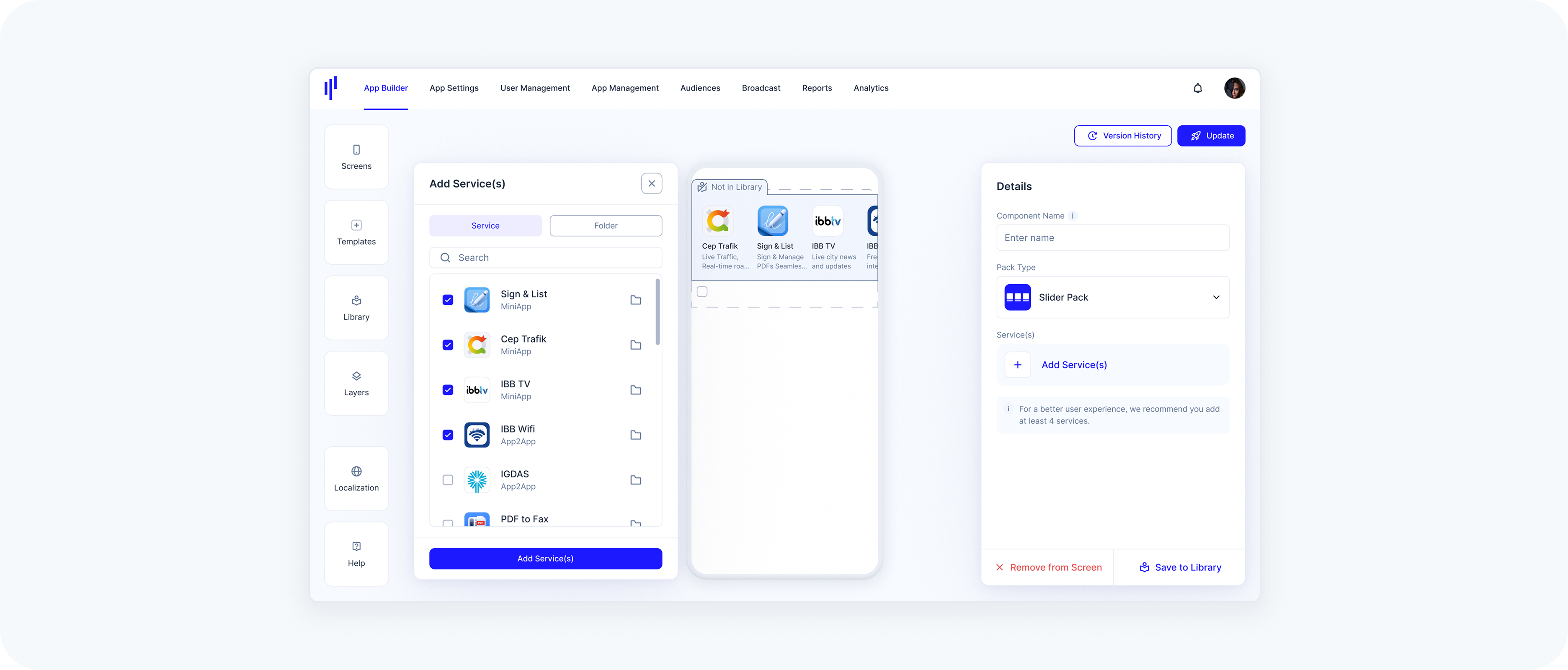
Slider Pack
The steps to set up a Slider Pack are the same as for Grid and List Packs:
Step 1 – Open the Templates Panel
From the left-hand toolbar, select Templates to open the panel.
Drag the List Pack onto a section in the screen preview.
Step 2 – Configure the Slider Pack
In the Details panel on the right:
Enter a name for your component in the Component Name field.
In the Pack Type dropdown, make sure Slider Pack is selected.
Step 3 – Add Services
Click Add Service(s) to open the service selection modal.
Use the checkboxes to select one or more services you'd like to display in the grid.
You can use the search bar or scroll to locate services.
- Services will appear live in the preview as you select them.
Step 4 – Finalize
- Review your selected services in the list.
Click the Add Service(s) button at the bottom right.
Widget
A Widget is a component that loads hosted web content inside the SuperApp. You provide a URL, and the SuperApp renders the content inside a dynamic container within the screen layout.
Once created in the Library, a Widget can be added to any screen using the Templates panel.
Layout & Visual Alignment
Widgets technically allow full-width content.
However, for visual consistency within the SuperApp:
- Standard components (Banners, News, Packs, etc.) use a 20px left and right margin.
If you want the Widget to visually align with other components on the screen, we recommend adding equivalent internal spacing to your hosted content.
This is not mandatory. Full-width content can still be used intentionally.
UX Recommendations: Widgets are designed to embed focused, lightweight web-based modules inside the SuperApp. For the best user experience:
Recommended
- Use responsive, mobile-optimized layouts
- Keep interactions touch-friendly
- Optimize for fast loading performance
- Ensure content adapts naturally to the SuperApp container
Use with Care
- Complex multi-page navigation flows
- Heavy web applications with deep routing
- Horizontally scrollable layouts that may conflict with vertical screen scrolling
Widgets should feel like an integrated part of the SuperApp experience, not like a separate standalone website.
- Have a publicly reachable URL for your widget content (HTTPS recommended).
- Ensure the content is responsive and can adapt to container height at runtime.
Step 1 – Open the Templates Panel
- From the left-hand toolbar, select Templates to open the panel.
- Drag the Widget component into the desired section on your screen.
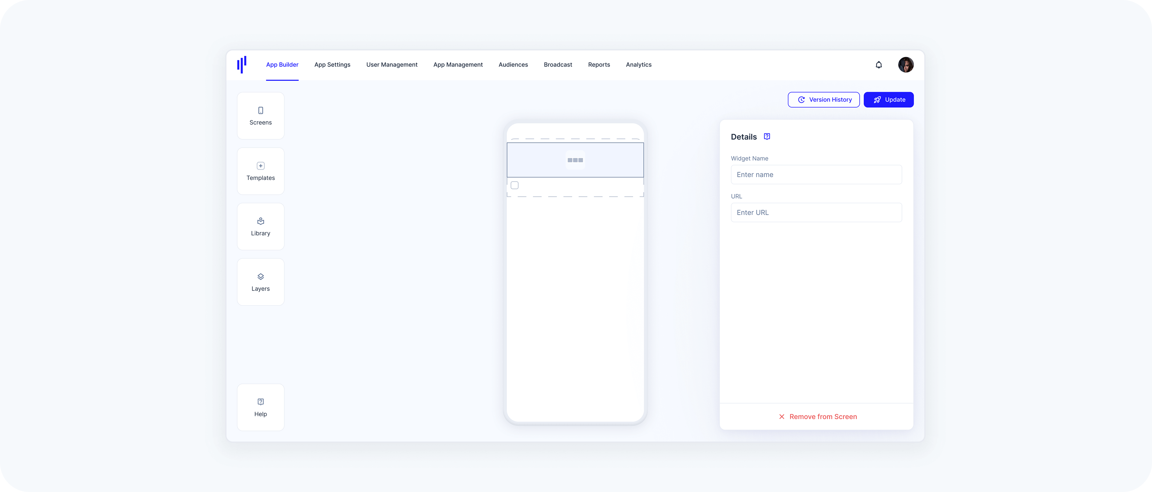
Step 2 – Configure the Widget
In the Details panel on the right:
Component Name – In the Details panel, provide a name for your component.
URL – Enter the hosted web content that should load inside the SuperApp.
To ensure external web content loads correctly and provides a good user experience inside the SuperApp Widget Template, please verify the following requirements before configuring a URL:
URL format: must be a valid URL (ideally HTTPS).
Height handling: The hosted website must provide a constrained height. The URL is loaded and JavaScript is injected to read document.body.scrollHeight, and the resulting value determines the module height.
Reachability: the URL must be reachable from the SuperApp runtime (network/VPN, allowlists, firewall rules, etc.).
Embeddability: hosted content must allow being embedded (avoid blocking headers such as restrictive X-Frame-Options / CSP frame-ancestors that would prevent rendering in a webview/iframe).
Mobile-ready: content should be responsive and usable on typical phone dimensions.