Layout Elements
Section
Sections help organize your screen layout. Each section serves as a container for one or more components, making it easier to group, style, and manage your content.
You can customize each section with the following layout elements:
Tabs: Use tabs to let users switch between different views or content types within the same section.
Important: Only one tabs area is allowed per section, and it always appears at the top of the section.
Titles: You can add multiple titles within a section to introduce, separate, or label content.
Components: These are the functional content blocks (e.g., banners, sliders, lists) that display services or visuals.
Components can be added in two ways:
As empty content blocks from the Templates panel (to be configured later)
As preconfigured components from the Library panel (already filled with details)
Adding a Section
Each screen starts with a default section already in place.
You can add additional sections in two ways:
Click the Add Section button in the Details panel (right side)
- This adds a new section below the currently selected one.
Drag and drop a Section block from the Templates panel into the screen preview.
The new section can be dropped above or below existing sections using drag-and-drop.
You can add as many sections as needed to structure your layout.
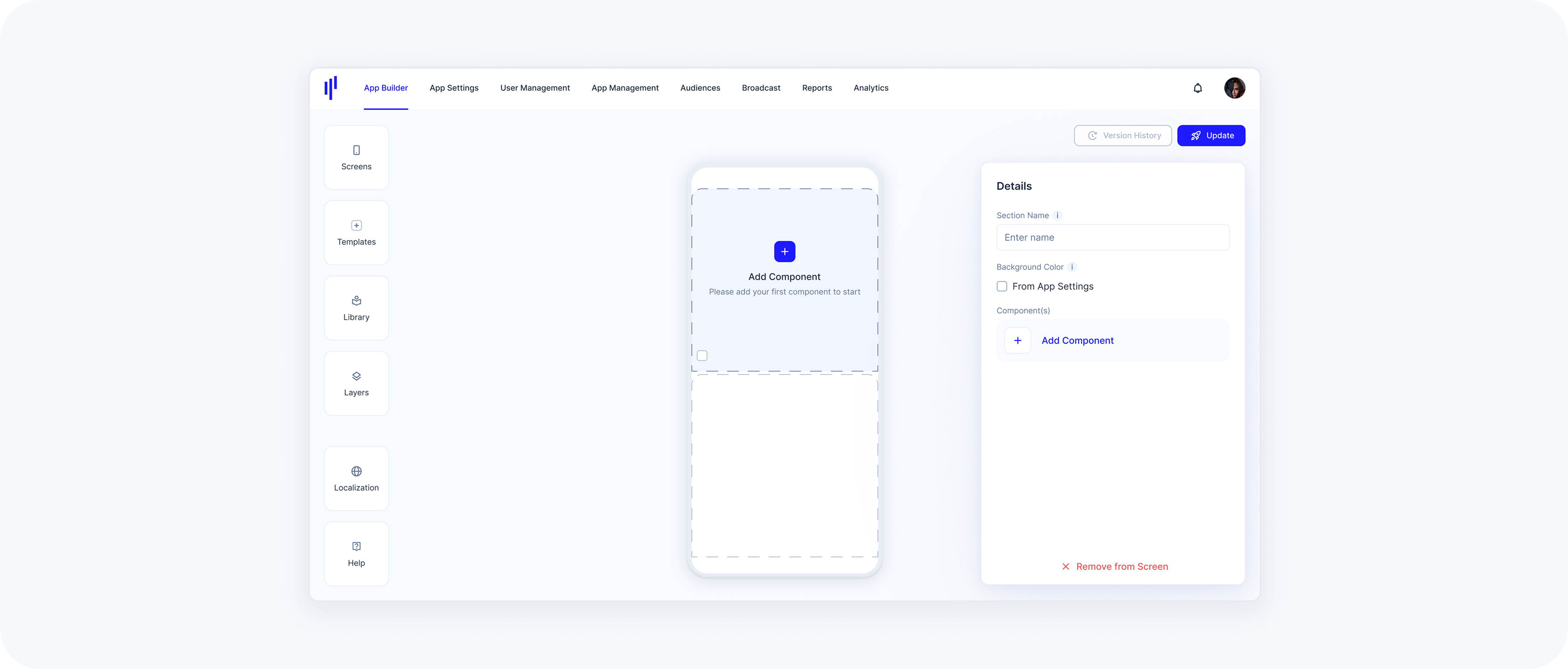
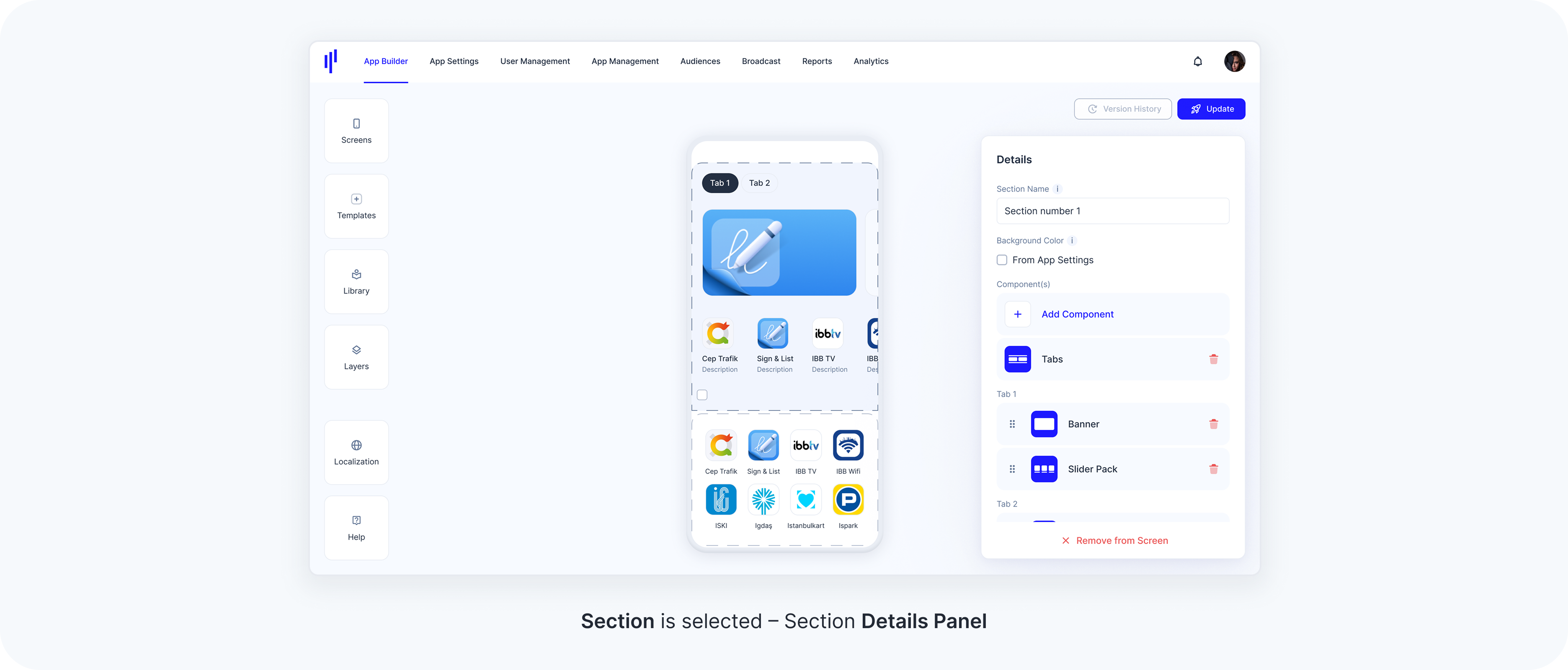
Section Properties
When a section is selected, the Details (right) panel shows its editable settings:
Section Name – Label to help identify the section internally.
Background Color – Only available for the top section of the screen.
When enabled, it applies the background color defined in App Settings > Branding > Color Theme.
To enable it, check the From App Settings box in the Details panel when the top section is selected.
Lower sections will not have this option — the background color setting only applies to the first (topmost) section of the screen.
Component(s) –
Tapping it opens the Library panel, where you can select a ready-to-use component.
Alternatively, you can drag empty component templates from the Templates panel into the section.
Reordering Sections
You can reorder sections in two ways:
- Directly on the Screen Preview
- Select the section you want to move.
- Drag and drop it to a new position above or below other sections.
- Via the Section List (when Home Screen is selected)
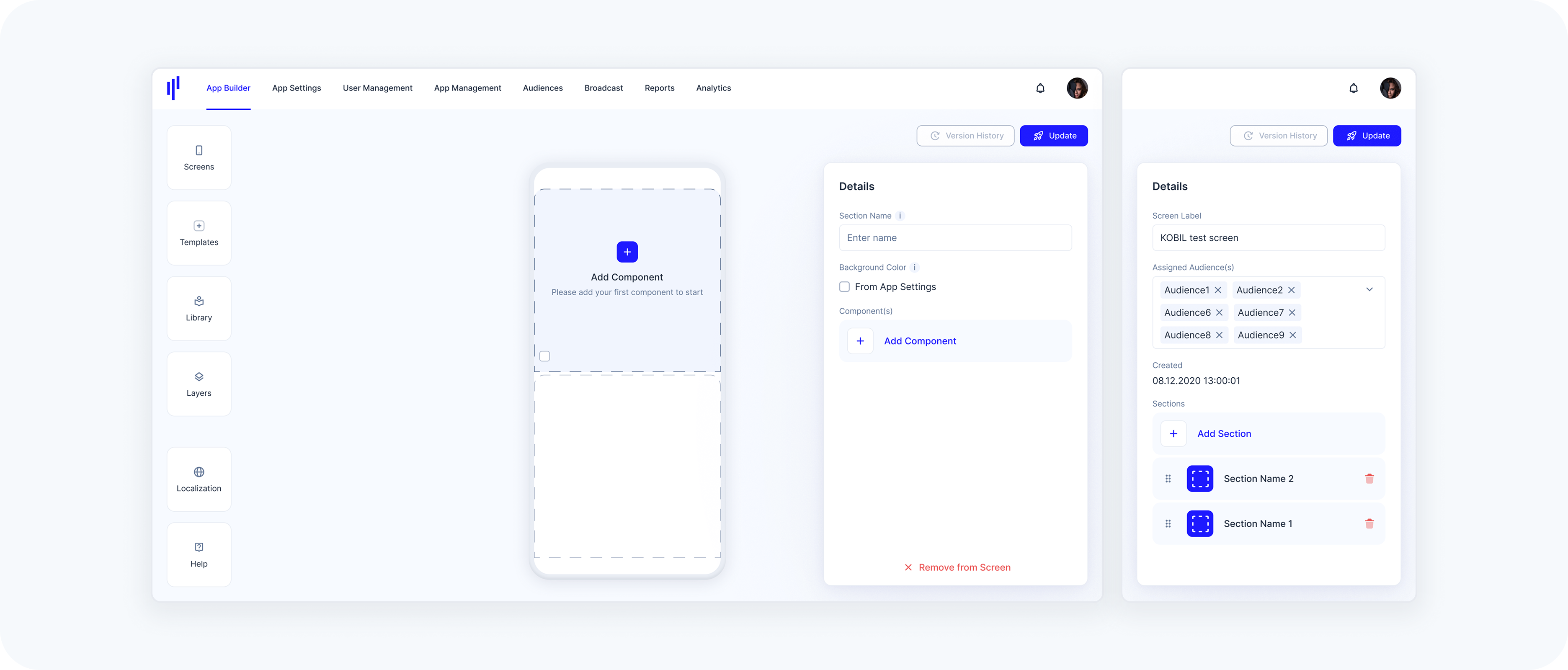
When the overall Home Screen is selected (not a specific section), you’ll see a list of all sections in the Details panel.
Use the drag handle (≡ icon) to move a section up or down within the list.
This allows you to manage layout order flexibly, especially on screens with many sections.
Removing a Section
There are two ways to delete a section, depending on what is currently selected:
- From the Section List (Home Screen selected)
If you’ve selected the overall Home Screen (not a specific section), you’ll see a list of all sections in the Details panel.
Each entry has a red trash icon — click it to delete the corresponding section.
- From a Selected Section
If a specific section is selected on the screen, its details will appear in the panel.
You can delete that section by clicking the red trash icon next to its name.
Removing a section removes all its titles, components, and layout elements. This action cannot be undone.
Tabs
Tabs help organize and group multiple components within a single section, using horizontal tab navigation. This is useful when you want to display different views or categories of content in the same screen area.
There are two types of tabs available:
Component-Based Tabs: These tabs contain App Builder components like Banners, News, Lists, etc., and are powered by service data.
Web-Based Tabs: These tabs display embedded external content (e.g., a web page, or dashboard).
You can mix both types of tabs in the same section if needed.
Adding a Tab Area
Each section can include one tab area, and this tab area is always positioned at the top of the section.
To add a tab area:
Go to the Templates panel
Drag the Tabs block into a section
A tab area always comes with two tabs by default. This is intentional, as a single tab would not offer any switching benefit — tabs are meant to toggle between multiple content blocks.
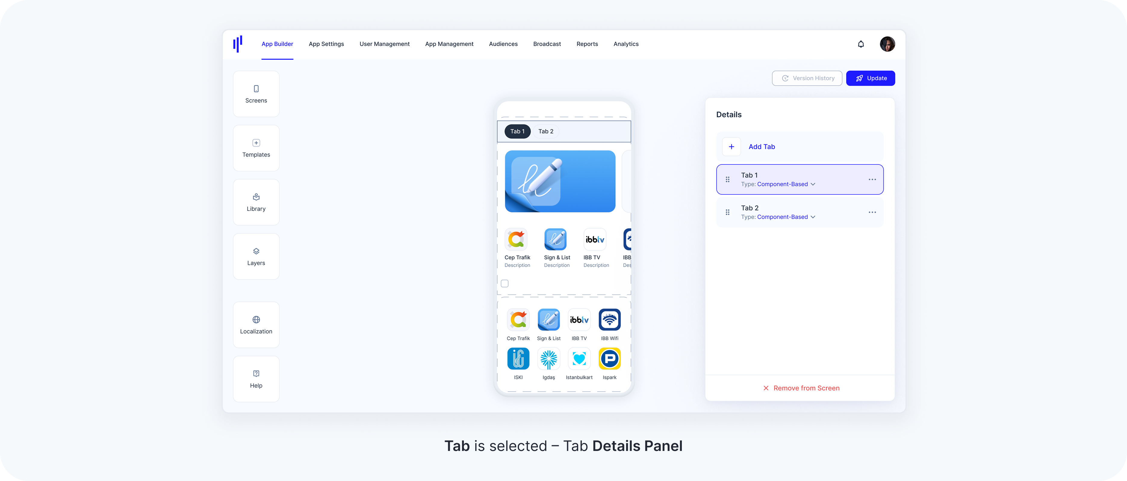
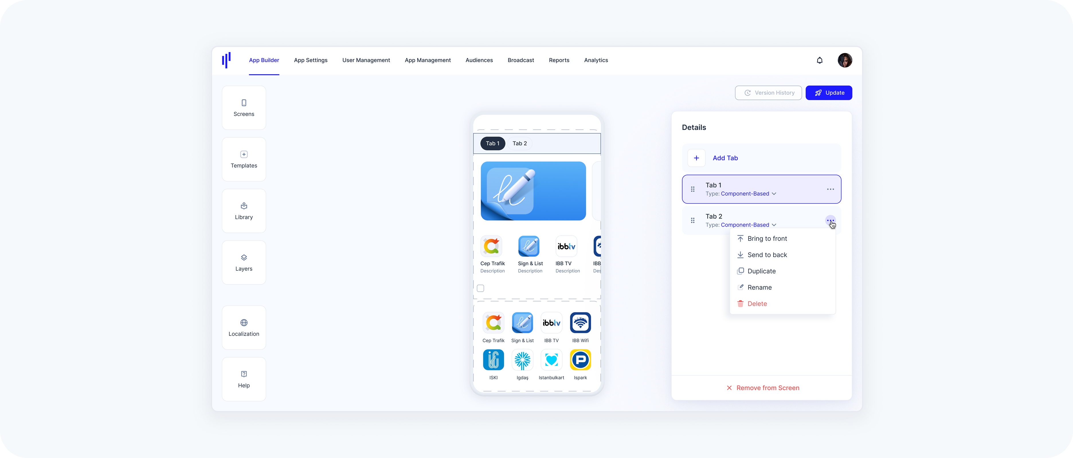
Tab Properties
When a tab area or a section is selected, the Details (right) panel displays a list of all tabs inside that section.
Each tab shows
- Label
Tab Type (dropdown): Switch between Component-Based and Web-Based
- Actions menu (⋯):
Bring to front – Moves the selected tab to the beginning of the row (first position). Useful when there are many tabs and dragging is difficult.
Send to back – Moves the selected tab to the end of the row (last position).
Duplicate – Creates an exact copy of the selected tab (including its content type and components).
Rename – Allows you to set a custom name for the tab to reflect its content (e.g., “Trending”, “Top Rated”).
Delete – Removes the selected tab from the tab group.
Tabs can be reordered by dragging them within the list.
Edge Cases & Limitations for Tabs
While configuring Tabs within a section, there are specific constraints and behaviors to ensure usability and maintain layout integrity:
Only One Tab Area per Section
Behavior: You cannot add more than one Tabs component to the same section.
UI Feedback: When a second Tabs area is dragged into the section, a red warning appears: “Only one Tabs area is allowed per section.”
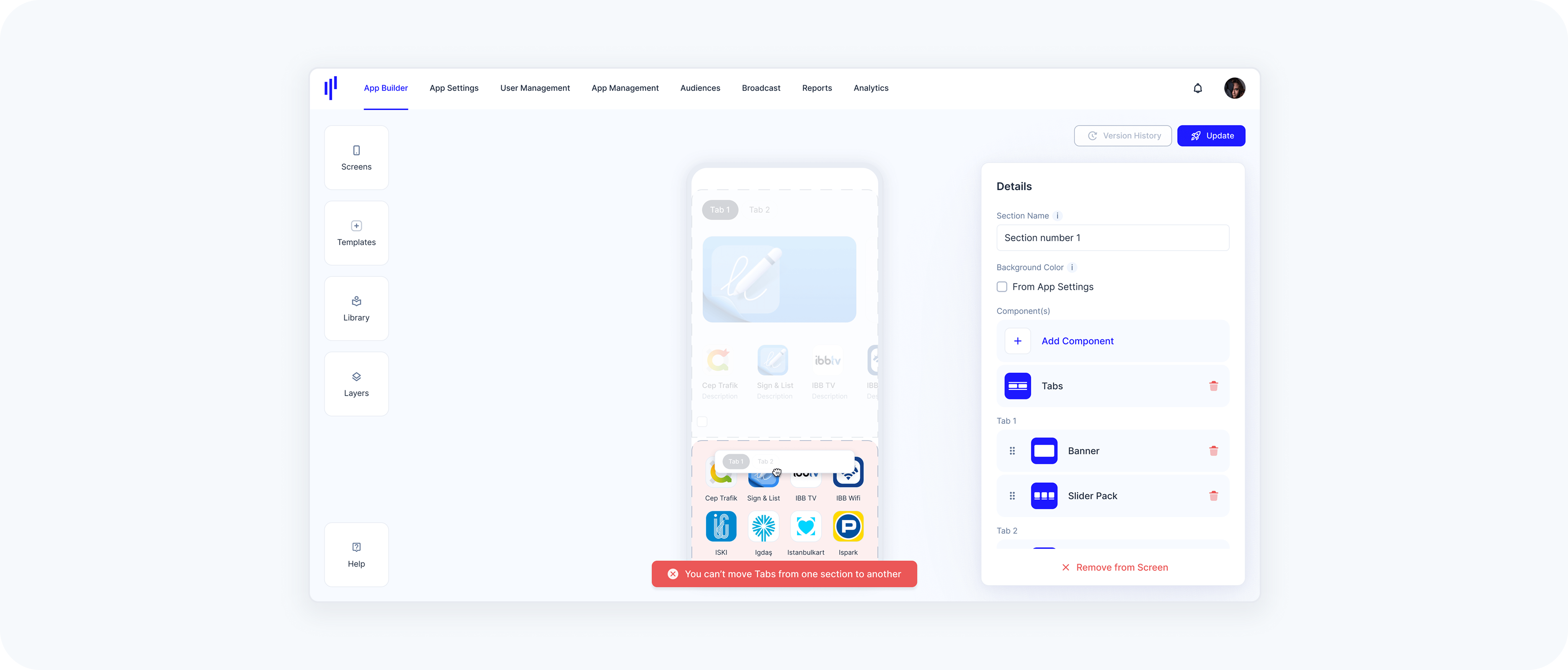
Tabs Cannot Be Moved Across Sections
Behavior: Tabs are section-specific and cannot be dragged into another section.
UI Feedback: If attempted, the interface shows a message: “You can’t move Tabs from one section to another.”
Removing the Tabs Component (Merge Option)
Behavior: If the entire Tabs component is deleted, all tab content will be merged into a single section.
Confirmation Modal: A warning is displayed: “Removing tabs will merge all of your components to one section. This action cannot be undone.” Users must explicitly confirm the action by clicking “Merge Components.”
Deleting a Tab When Only Two Tabs Exist
Behavior: Tabs need at least two items to function. If a user deletes one of the last two tabs:
- The entire Tabs area is removed.
The content of the remaining tab is displayed directly in the section (as if there was no Tabs area).
No confirmation modal is shown for this. It’s an automatic fallback behavior.
Title
Titles help structure your screen content by introducing visual headings above components or groups of components. They’re useful for clearly labeling content areas and improving readability.
Adding a Title
Titles can be added to any section using the Templates Panel → drag the Title into the desired position within the section.
Titles can be placed above or below any component.
You can add as many titles as needed to a section.
Titles serve purely visual and structural purposes — they do not affect the functionality of the component.
Title Properties
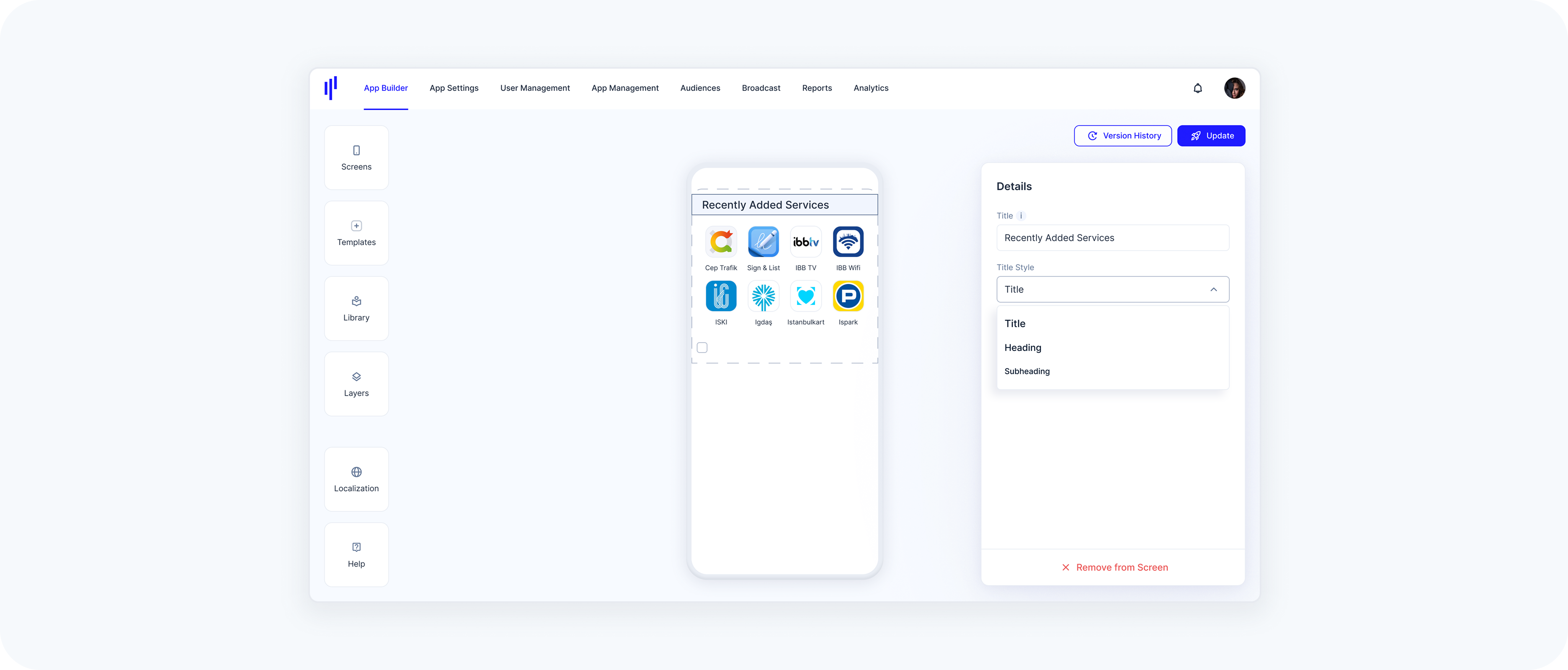
Once a Title is added, you’ll see its configuration options in the Details Panel:
Title: Enter the desired heading text (e.g., “Recently Added Services”).
Title Style: Choose from three visual hierarchy levels:
Title – the largest and most prominent
Heading – slightly smaller, often used for subsections
Subheading – smaller text, best for labeling grouped content
Note: The chosen style impacts text size and weight, helping to visually differentiate between content blocks.
Removing a Title
To delete a title:
Select the Title in the preview.
In the Details Panel on the right, click the red Remove from Screen button at the bottom.
- The title will be immediately removed from the section.
There’s no confirmation prompt — once clicked, the title is deleted right away. If needed, you can drag a new title back into the section at any time.
Tip: Titles can be freely positioned across the entire screen using drag-and-drop. You can:
Place them above or below any component within a section
Move them into a different section if needed