Templates
The Templates panel helps you quickly build your app layout using pre-built content blocks and layout tools. These are drag-and-drop elements that can be added to any section of a screen.
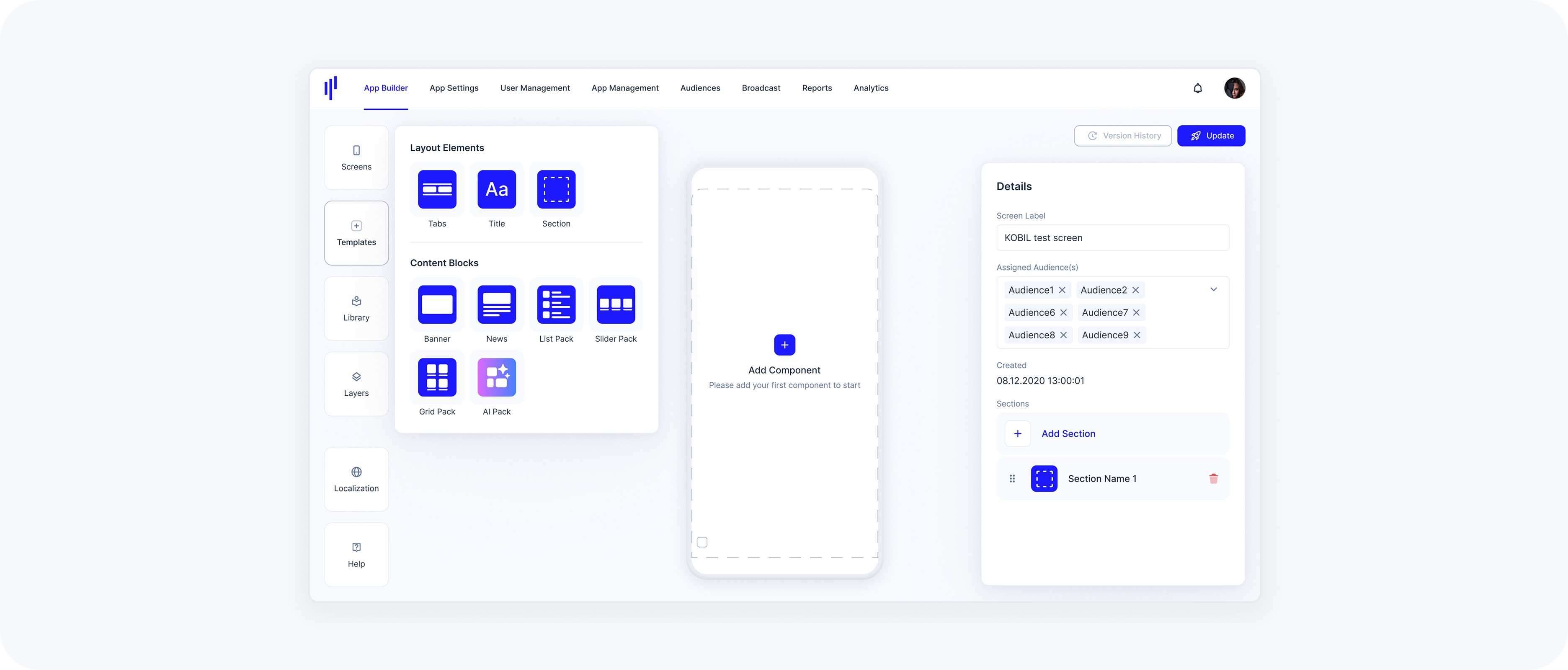
Templates are divided into two categories: Layout Elements and Content (Component) Blocks.
Understanding Templates
This panel provides the structural and visual building blocks to design your app's Home Screens. From headers and tabs to interactive content packs, it enables a modular and flexible layout. Templates are not connected to existing components in your Library — each one you drag into a screen becomes a new component instance.
Available Templates
Layout Elements
These elements help you structure the screen layout:
Tabs – Organize content within a section using tabbed views
Title – Add a heading to any component or section
Section – Insert a new vertical block (section) on your screen to place content inside
Layout elements are primarily for organizing and structuring how content is displayed.
Content (Component) Blocks
These blocks serve as visual placeholders for actual content. Each block can be customized and linked to services or URLs.
Banner – Eye-catching visual block, linked to a service
News – News feed or text-based card
List Pack – Vertically stacked list view
Slider Pack – Horizontally scrollable card layout
Grid Pack – Grid layout with equal-sized boxes for services or folders
AI Pack – Dynamically generated content based on user behavior
All template blocks are empty by default — they act as visual shells. You’ll configure their content after placing them on the screen.