Components
Components are reusable building blocks used to structure and visually enrich the screens of your app. Instead of creating content from scratch each time, components allow you to define elements once and reuse them across multiple screens—ensuring consistency, saving time, and simplifying updates.
The App Builder currently supports several types of components:
- Banner – Visual elements used to highlight services, promotions, or information.
- Pack – A collection of multiple services displayed in grid, list, or slider format.
- News – Designed for displaying news content in a compact, readable format.
Each type has its own layout and purpose and can be added, managed, and reused from the central Library.
Types of Components
Components come in different formats to support various content presentation needs. You can choose the most suitable type depending on what kind of user interaction or visual layout you want to achieve.
Banner Component: Used to visually highlight services or promotions. You can configure banners in three ways:
- No Service Details: Only the banner media will be shown (no additional info).
- Service Details Inside: Title & description from the linked service appear within the banner area.
- Service Details Outside: Title & description appear below the banner, separated from the image.
Pack Component:
- Grid Pack: Displays services in a grid layout. Great for showcasing multiple services at once, each with an icon and a short label.
- List Pack: Displays services in a vertically stacked list. Ideal when you want users to read full titles, subtitles, or descriptions.
- Slider Pack: Displays services in a horizontally scrollable layout. Helps save space while keeping multiple services visible through swiping.
- News Component: A component type that presents informative or promotional content.
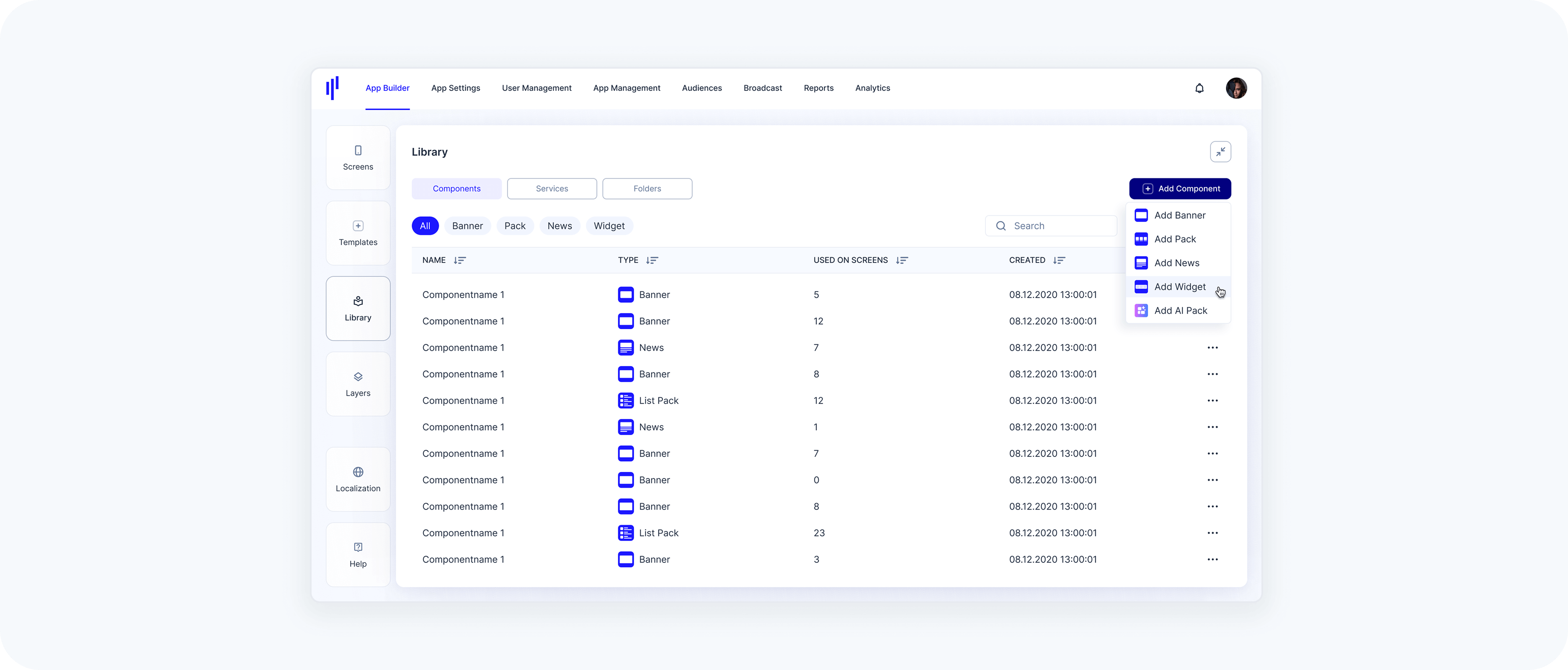
Component Tab – UI Overview
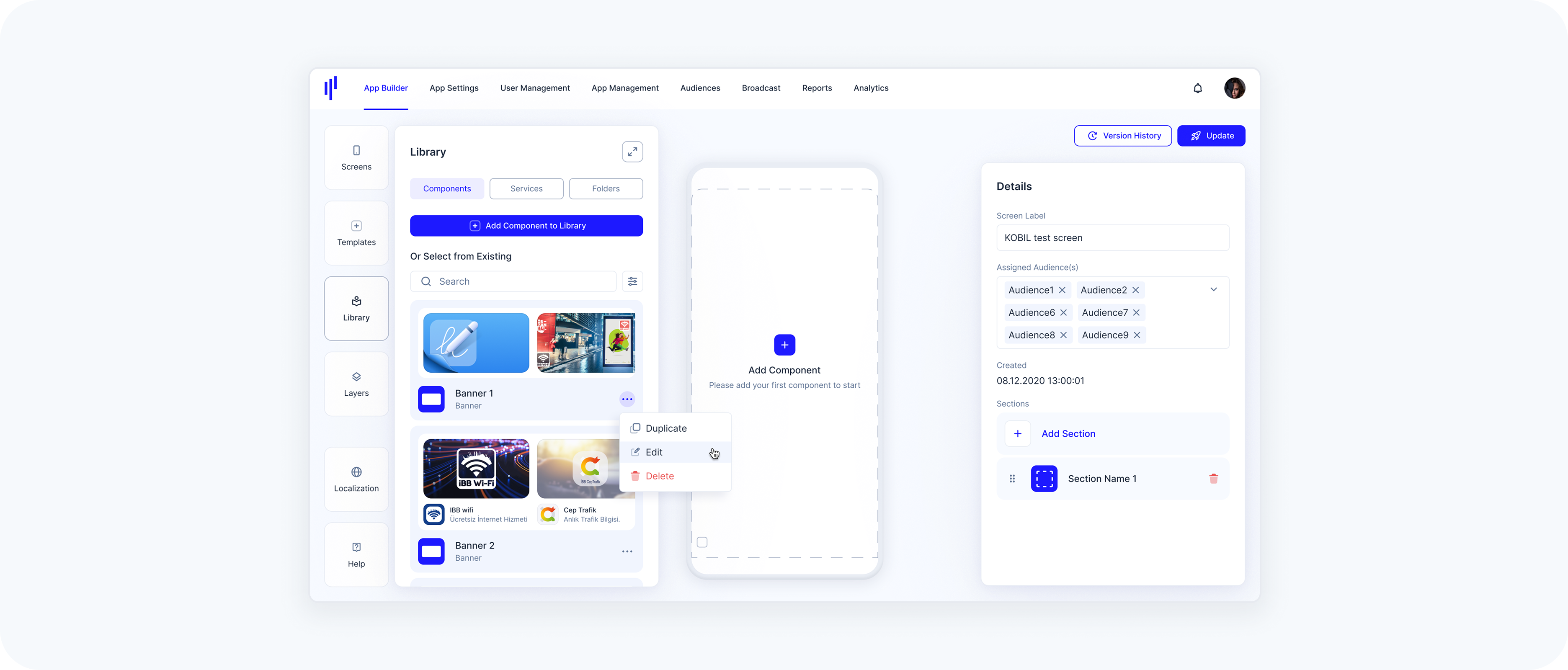
To manage reusable components, go to the Library and switch to the Components tab. This view allows you to search, filter, preview, and manage all existing components in one place.
- Component Tab – Empty State
- When no components have been added yet, users see an empty state with a button labeled “Add Component to Library.” This is the starting point for creating components.
- Component Tab – Filled State
- Once components are added, they appear as cards, each showing:
- Component Name
- Component Type (Banner, Grid Pack, List Pack, etc.)
- A visual preview (Thumbnail)
- Users can:
- Search – Quickly find a component by name.
- Filter – Narrow down results by component type (e.g., Banner, Pack, News).
- Component Tab – Full-Screen View
- Click the expand icon in the top right corner to expand the library view and see more components at once. This layout includes all actions and previews in a larger table view.
Components Actions Menu
- Each component card or table row includes a three-dot menu offering the following actions:
- Edit – Opens the component details in a form.
- Delete – Prompts a confirmation to permanently remove the component.
Creating a Banner
A Banner is a reusable visual component used to highlight a service or external link. Banners are ideal for promotions, announcements, or drawing attention to key features. You can create banners with or without service details, depending on the layout you want.
Step 1 – Open the Library Panel
- Click Library from the left toolbar.
- Make sure the Components tab is selected.
- Click Add Component to Library (or Add Component in extended view).
- Select Add Banner from the dropdown.
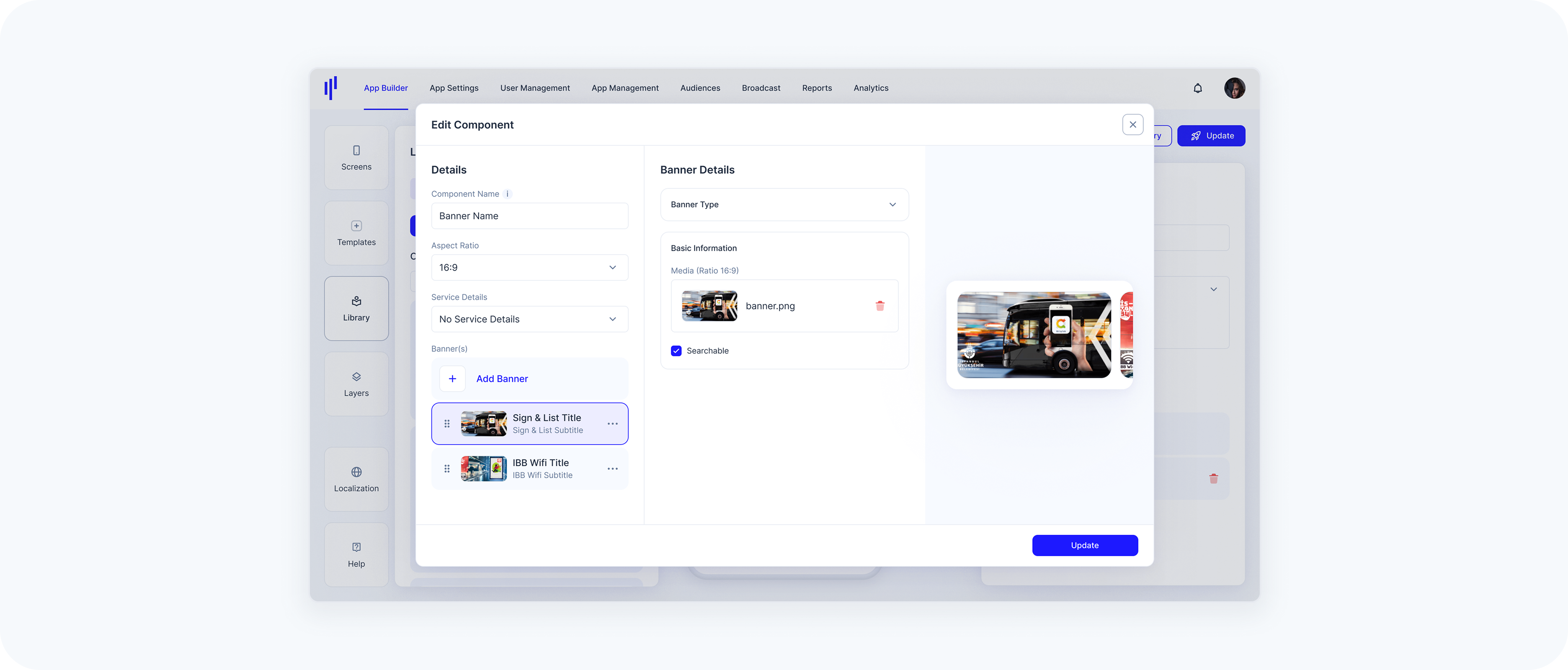
Step 2 – Fill Out the Details
- In the banner creation form:
- Component Name – This will be used internally in the Library.
- Aspect Ratio – Choose from predefined sizes (2:1, 16:9, 4:3, 1:1, Custom).
- Service Details – Choose how service information will be displayed on the banner:
- No Service Details → Only the banner media will be shown (no additional info).
- Display Service Details Inside → Title & description from the service appear within the banner area.
- Display Service Details Outside → Title & description appear below the banner, separated from the image.
Step 3 – Add Banner(s)
- Each Banner Component can include one or more banner items — these are the actual visuals and links that users will interact with.
- Click Add Banner.
- Select the Banner Type:
- Service → Link to a MiniApp, App2App, or Chat service already available in your Library.
- URL → Link to an external website or a specific deep link.
- Upload a Banner Image (JPG or PNG). This is the visual that will be displayed in the component.
- Depending on the banner type:
- If Service → Select a service from the list.
- If URL → Enter the destination URL in the field provided.
- (Optional) Toggle Searchable to include this component in the SuperApp’s search results.
You can add as many banners as needed. When more than one is added, users can swipe horizontally to navigate through them in the app.
Step 4 – Finalize
Once you've added all your banner items and configured the layout:
- Review the component name, aspect ratio, and service details layout.
- Make sure each banner item includes a valid image and either:
- A selected service, or
- A valid external URL
- Click Create (bottom right of the screen).
After saving:
- Your component will appear in the Components Library.
- It’s now ready to be dragged into a screen section.
- If everything is correctly filled out, you’ll see a confirmation message.
- If required fields are missing, an error message will appear. You can fix the issue and try again.
Creating a Grid Pack
A Grid Pack displays multiple services or folders in a compact, tile-based layout. It’s ideal for visually showcasing 4–8 services in a clean and balanced grid structure.
Step 1 – Open the Library Panel
- Click Library from the left toolbar.
- Make sure the Components tab is selected.
- Click Add Component → Select Add Pack.
Step 2 – Enter Basic Details
Component Name – Type a name (for internal use and later identification).
In the Pack Type dropdown, choose Grid Pack.
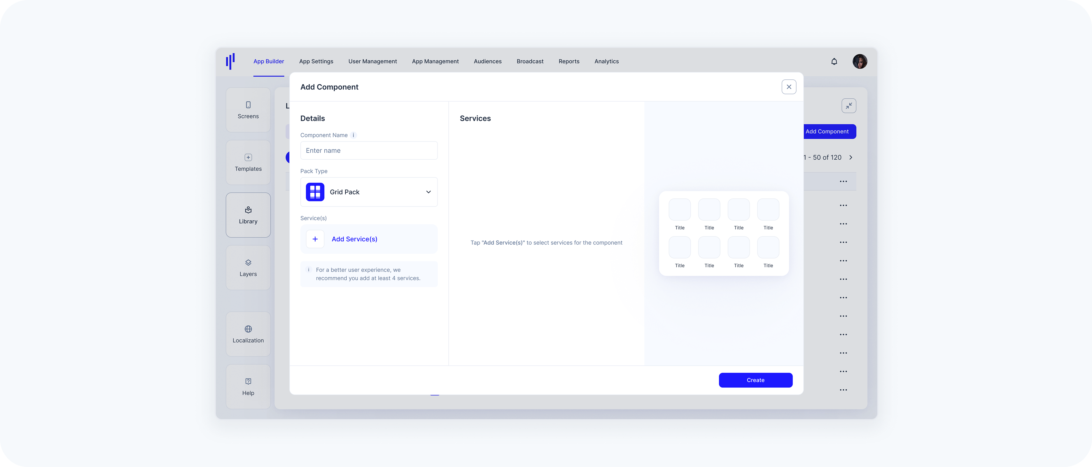
Step 3 – Add Services
- Click Add Service(s).
In the right-hand service list, check the services you want to include.
- You can use the search bar or scroll to locate services.
- Services appear live in the preview as you select them.
To improve layout and experience, it's recommended to add at least 4 services.
Step 4 – Finalize and Create
- Review your selected services in the list on the left.
- Click the Create button at the bottom right.
Your Grid Pack component is now added to the Library and can be reused across screens.
Creating a List or Slider Pack
The steps to create these are the same as for Grid Packs, with just two differences:
- Choose the Pack Type
- For a vertical layout, select List Pack.
- For a horizontal scrolling layout, select Slider Pack.
- Preview Layout
- The layout preview will update accordingly on the right side of the modal.
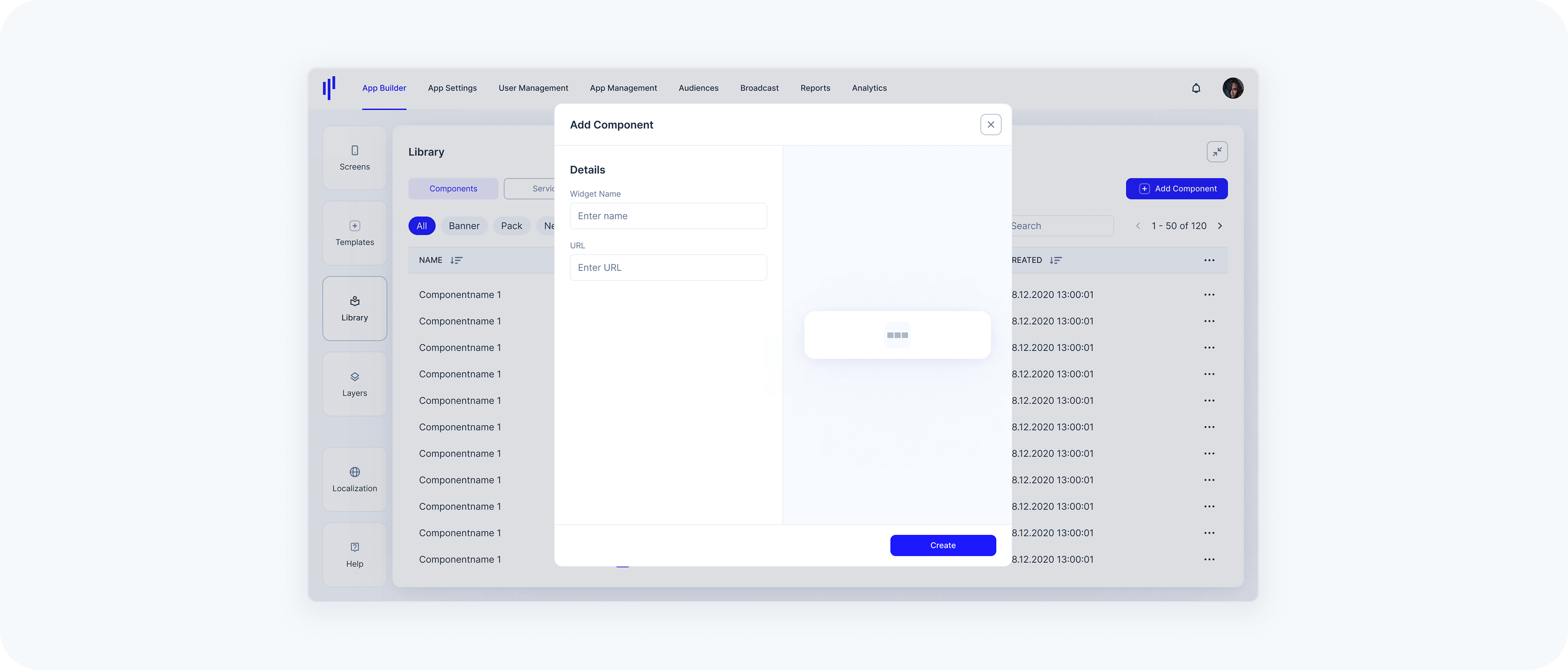
Creating a Widget
A Widget is a component that loads hosted web content inside the SuperApp. You provide a URL, and the SuperApp renders the content inside a dynamic container within the screen layout.
Once created in the Library, a Widget can be added to any screen using the Templates panel.
Layout & Visual Alignment
Widgets technically allow full-width content.
However, for visual consistency within the SuperApp:
- Standard components (Banners, News, Packs, etc.) use a 20px left and right margin.
If you want the Widget to visually align with other components on the screen, we recommend adding equivalent internal spacing to your hosted content.
This is not mandatory. Full-width content can still be used intentionally.
UX Recommendations:
Widgets are designed to embed focused, lightweight web-based modules inside the SuperApp. For the best user experience:
Recommended
- Use responsive, mobile-optimized layouts
- Keep interactions touch-friendly
- Optimize for fast loading performance
- Ensure content adapts naturally to the SuperApp container
Use with Care
- Complex multi-page navigation flows
- Heavy web applications with deep routing
- Horizontally scrollable layouts that may conflict with vertical screen scrolling
Widgets should feel like an integrated part of the SuperApp experience, not like a separate standalone website.
- Have a publicly reachable URL for your widget content (HTTPS recommended).
- Ensure the content is responsive and can adapt to container height at runtime.
Step 1 – Open the Library Panel
- Click Library from the left toolbar.
- Make sure the Components tab is selected.
- Click Add Component on the top right.
- Select Add Widget from the dropdown.
Step 2 – Fill Out the Details
In the widget creation form:
Component Name – Enter a name to identify the Widget in your Library.
URL – Enter the hosted web content that should load inside the SuperApp.
To ensure external web content loads correctly and provides a good user experience inside the SuperApp Widget Template, please verify the following requirements before configuring a URL:
URL format: must be a valid URL (ideally HTTPS).
Height handling: The hosted website must provide a constrained height. The URL is loaded and JavaScript is injected to read document.body.scrollHeight, and the resulting value determines the module height.
Reachability: the URL must be reachable from the SuperApp runtime (network/VPN, allowlists, firewall rules, etc.).
Embeddability: hosted content must allow being embedded (avoid blocking headers such as restrictive X-Frame-Options / CSP frame-ancestors that would prevent rendering in a webview/iframe).
Mobile-ready: content should be responsive and usable on typical phone dimensions.
Step 3 – Create the Component
Once all fields are filled out, click Create to save the component and add it to the Library.
Adding a Component to a Screen
Once you've created a component in the Library, you can use it on any screen by simply dragging and dropping it into the screen preview area.
Step 1 – Open the Library Panel
- Open the Library Panel → make sure you're in the Components tab.
Step 2 – Locate your Component
- Use the search bar or scroll through the list to find the component you want to use.
Step 3 – Drag & Drop
- Click and drag the desired component (e.g., a Banner or Pack) onto the phone preview on the right.
- You'll see a placeholder area on the screen where you can drop the component.
Step 4 – Configure as Needed
- Once added, the component will appear within the selected section of the screen. You can view or adjust the details in the panel on the right.
Editing a Component
Sometimes you may want to update the contents or behavior of an existing component without recreating it from scratch. You can edit all component types directly from the Library.
Step 1 – Navigate to the Library Panel
- Go to Library → make sure you're in the Components tab.
Step 2 – Open the Action Menu
- Locate the component you want to edit. Click the 3-dot menu on the right.
Step 3 – Click "Edit"
- Select Edit from the dropdown.
Step 4 – Update the Component Details
- The edit modal is almost identical to the one used for creating components. You can:
- Change the Component Name.
- Adjust the Aspect Ratio (for banners).
- Modify Service Details.
- Add, remove, or reorder banner items or services, depending on the component type.
- Replace or update media files (e.g., banner image).
- Toggle the Searchable option (available for banners with service details).
Step 5 – Save Changes
- Click the Update button to save your changes. A confirmation message will appear once the component has been successfully updated.
Note: If a component is used on multiple screens, editing it in the Library will affect all screens where that component is included.
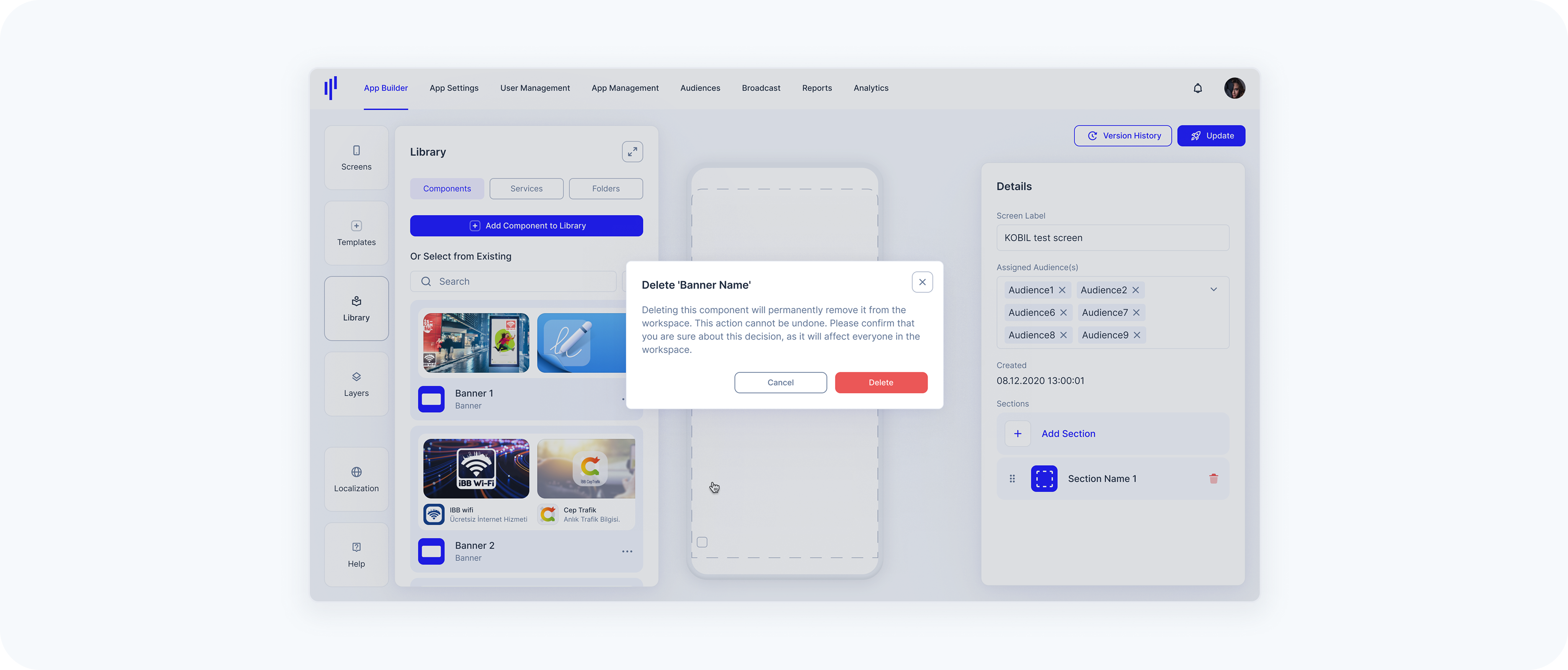
Deleting a Component
If a component is no longer needed, you can remove it directly from the Library.
Important Notes: Deleting a component will remove it from all screens it is currently used on. This action is permanent and cannot be undone.
Step 1 – Navigate to the Library Panel
- Go to Library → switch to the Components tab.
Step 2 – Open the Action Menu
Locate the component you want to delete. Click the 3-dot menu on the right.
Step 3 – Select "Delete"
- Click the Delete option from the dropdown menu.
Step 4 – Confirm Deletion
Click Delete in the confirmation dialog. This action will permanently remove the component from your workspace.